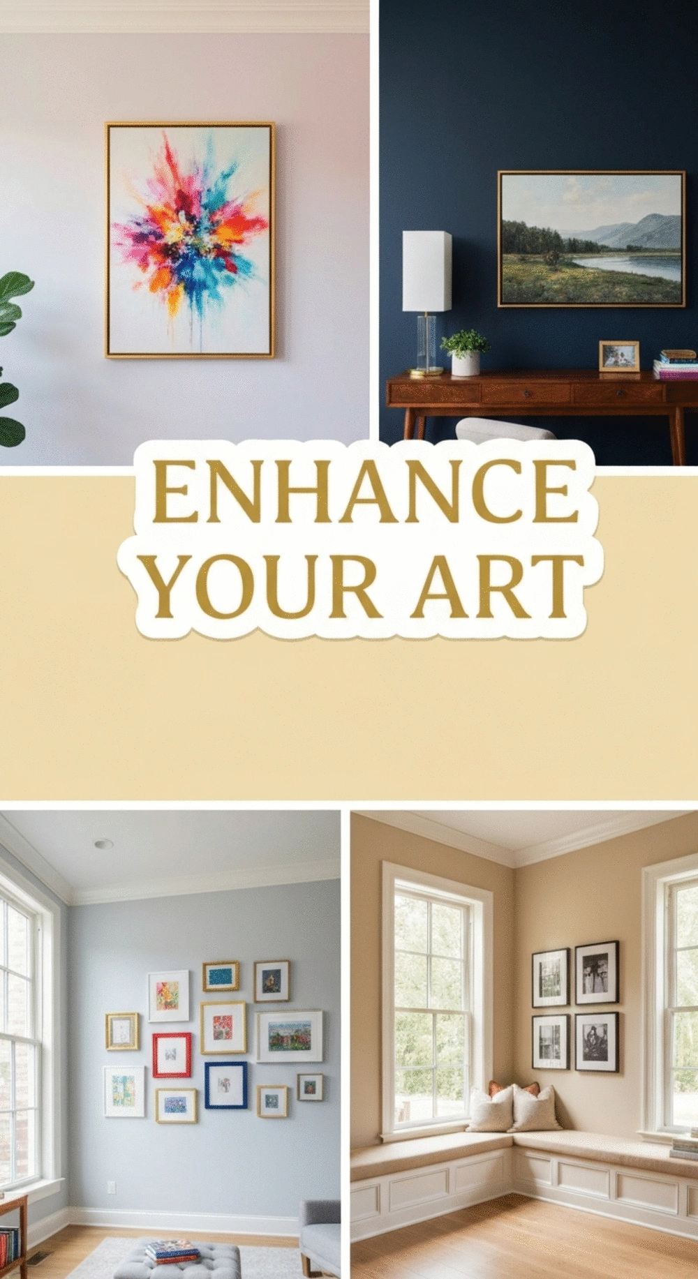
Color can transform not just walls but the entire atmosphere of a space, enhancing the way we experience art. By understanding the nuanced relationship between wall colors and art, you can create a living environment that resonates with your personal style and elevates your artworks.
As an Amazon Associate I earn from qualifying purchases. Affiliate links may earn me a commission at no extra cost to you.
What You Will Learn
- The significance of wall colors goes beyond aesthetics; they profoundly affect emotional connections to art.
- Different hues can create distinct atmospheres—warm tones promote coziness, while cool tones encourage tranquility.
- Color psychology is vital; colors like yellow inspire happiness, while blue can instill calmness, influencing how art is perceived.
- Understanding color theory can help in selecting complementary shades that enhance art pieces, making them stand out.
- Aligning wall colors with your personal style and the dominant colors in your artwork creates a cohesive and inviting space.
- Utilizing the right lighting significantly alters the perception of both wall colors and artwork, enriching the viewing experience.
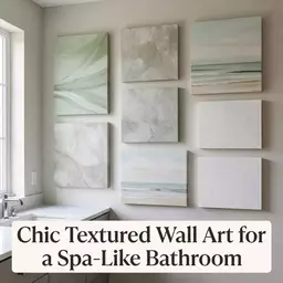
- Incorporating textures along with colors adds depth and interest, making your art display more engaging.
Understanding the Impact of Wall Colors on Art Perception
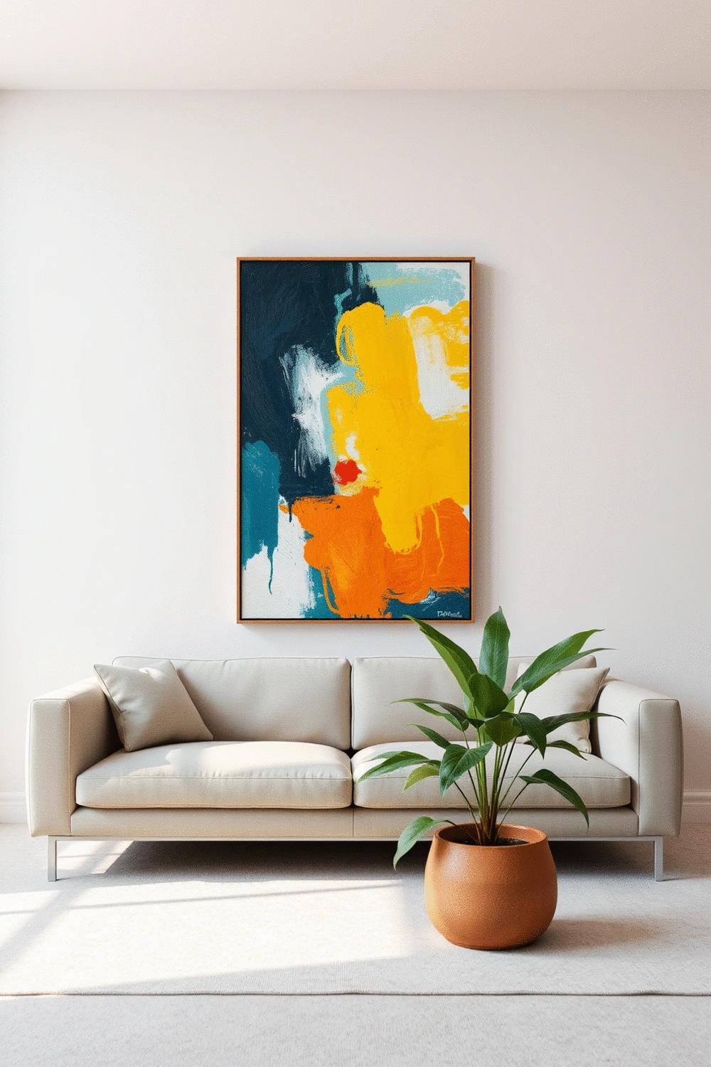
As an interior design enthusiast, I've always been captivated by how wall colors can dramatically change the way we perceive art. The right hue can enhance the beauty of your favorite pieces, making them the focal points of a room. When it comes to your art collection, choosing the right wall color is just as important as selecting the artwork itself. Let’s explore why this is the case!
Wall colors set the mood and tone of a space while influencing the overall experience of viewing art. If you have a vibrant piece, a muted wall may allow it to stand out, whereas a bold color can create a dynamic backdrop that energizes the artwork. Each choice invites viewers to interact differently with the art, creating a unique experience every time they enter the room.
Why Wall Color Matters for Your Art Collection
The significance of wall colors extends beyond aesthetics; it profoundly impacts how we connect with our art. Here are a few reasons why wall color matters:
- Enhances Visual Appeal: The right color can make your artwork more visually appealing, drawing attention to its details.
- Creates Atmosphere: Colors can evoke emotions—warm tones may create a cozy vibe, while cool tones might promote calmness.
- Defines Space: Colors influence how we perceive the size and shape of a room, affecting the overall feel of your art display.
In my experience with Wall Art Cozy Space Vibes, I've seen how important it is to pair wall colors with the emotions you want your space to evoke. When considering your art collection, think about how different hues can affect your home’s atmosphere! For more insights, you might find this article on inviting living room color schemes helpful.
Color Psychology: How Colors Influence Mood and Art Appreciation
Color psychology plays a crucial role in our reactions to art. For instance, studies show that blue can inspire feelings of tranquility, while red may ignite passion and excitement. Understanding these psychological effects is key when choosing wall colors to complement your art collection.
Each color has its own unique influence on mood and perception, which can shift the viewer's experience. For example:
- Yellow: Often associated with happiness, it can brighten a space and stimulate creativity.
- Green: Represents tranquility and nature, making it ideal for calming artwork.
- Purple: Known for its richness, it can add a sense of luxury and sophistication to your art display.
By considering color psychology, you can tailor the mood of your space to match the emotions that your artwork expresses, creating a cohesive and inviting atmosphere. Discover more about color psychology tips for boosting small space mood.
Exploring Color Theory and Its Relevance to Art Displays
Color theory is a fundamental aspect of interior design, particularly when it comes to how we appreciate art. The principles of color theory can guide you in selecting colors that not only complement each other but also enhance the beauty of your art pieces.
For example, using complementary colors—those opposite each other on the color wheel—can create striking contrasts that make artwork pop. Here are some key concepts to keep in mind:
- Complementary Colors: Pairing colors like blue and orange can produce a vibrant look.
- Analogous Colors: Using colors that are next to each other, like blue and green, can create a serene and harmonious effect.
- Triadic Colors: This scheme involves using three colors spaced evenly apart on the color wheel for a balanced and lively display.
Incorporating these principles can transform your walls into a beautiful canvas that highlights your art collection. If you’d like to dive deeper into color selection, check out my post on how to choose the perfect color scheme for your gallery wall!
Integrating Personal Style into Your Wall Color Choices
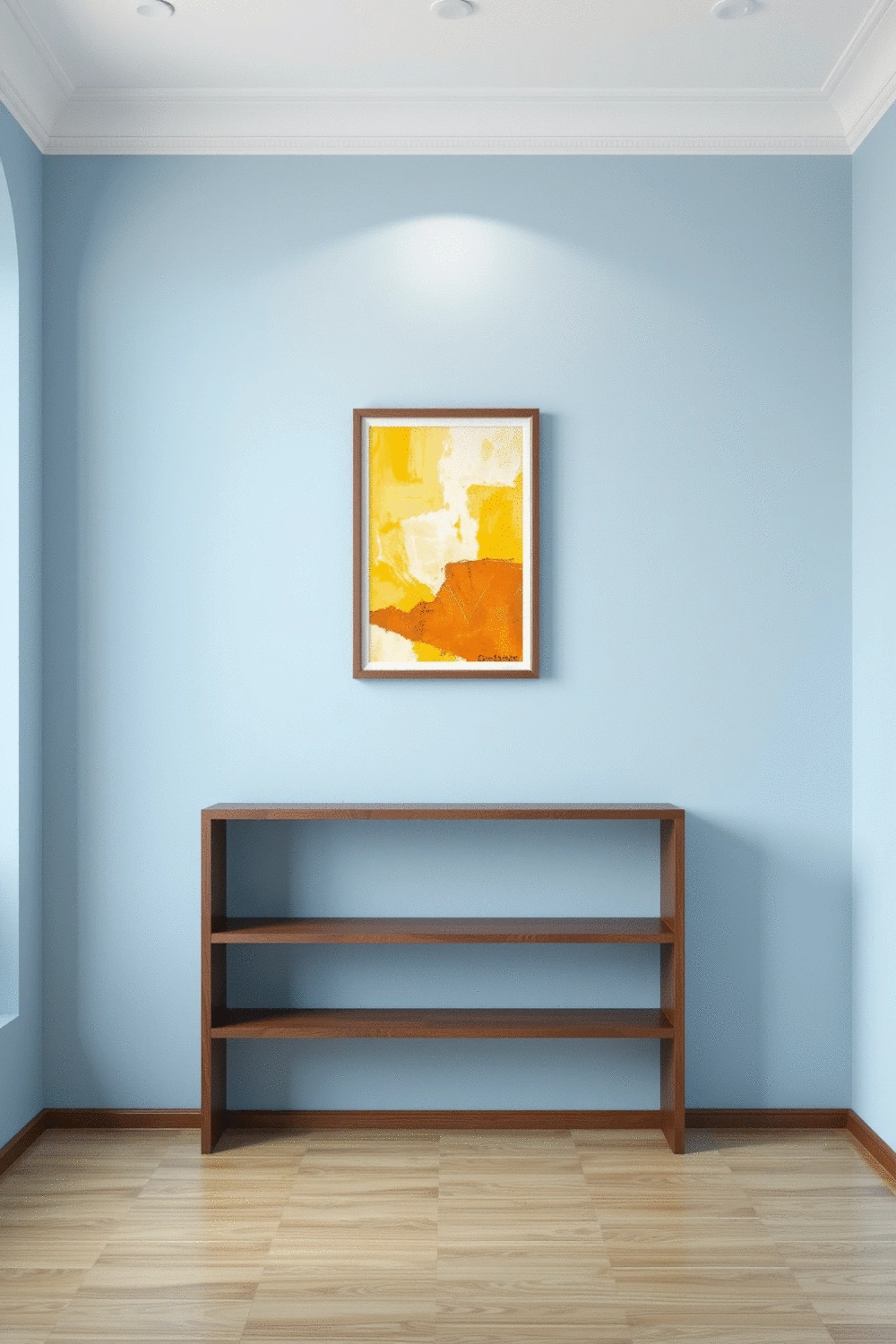
Choosing wall colors is a deeply personal journey. It's not just about what looks good; it's about what resonates with your individual style and the art you treasure. When selecting wall colors, it's essential to align them with your art collection to create a cohesive atmosphere that reflects your personality.
Start by assessing the colors present in your art pieces. Are they vibrant and bold, or soft and muted? This will help guide your choice. For instance, if your artwork features warm colors, consider using complementary warm tones on the wall to create a harmonious look. Alternatively, a neutral backdrop can make vibrant colors pop, inviting a dynamic contrast.
Aligning Wall Colors with Individual Art Styles
When selecting wall colors, think about how they will enhance your specific art style. Here are a few tips to consider:
- Look for colors that echo the dominant hues in your artworks.
- Consider the mood you want to cultivate; calm blues or greens work well for serene pieces, while vivid reds or yellows may suit more energetic art.
- Use the color wheel to identify complementary colors that will make your collection shine.
As I’ve often found in my work with Wall Art Cozy Space Vibes, a well-chosen wall color can dramatically enhance the viewing experience of your art, allowing the pieces to breathe and speak for themselves.
Creating a Unique Art Space That Tells Your Story
Your home is a canvas that narrates your story—each wall color choice is a chapter in that narrative. To make your space truly unique:
- Incorporate colors that have meaning to you, such as shades that remind you of a favorite travel destination or a cherished memory.
- Use colors that reflect your personality; if you’re adventurous, bold colors might be your style, while a more subdued palette could indicate a preference for calmness.
- Consider adding personal touches, like a gallery wall that showcases not just your art, but also photographs and mementos that resonate with your journey.
At Wall Art Cozy Space Vibes, we believe that every element in your home—especially wall colors—can create a cozy, inviting atmosphere that tells your unique story.
Frequently Asked Questions (FAQs)
- Q: How do wall colors affect the perception of art?
- A: Wall colors significantly influence the mood and tone of a room, directly impacting how art is perceived. A complementary color can make artwork stand out, while a contrasting color can create a vibrant backdrop, altering the viewer's experience.
- Q: What is color psychology and how does it relate to art displays?
- A: Color psychology studies how different colors influence human emotions and behavior. In art displays, understanding this helps in choosing wall colors that evoke specific moods (e.g., blue for tranquility, yellow for happiness), enhancing the emotional connection with the artwork.
- Q: Can color theory help me choose wall colors for my art?
- A: Absolutely. Color theory provides principles like complementary, analogous, and triadic schemes that guide you in selecting harmonious or contrasting colors. This can make your art pop or create a serene, cohesive look.
- Q: How can I align wall colors with my personal style and art?
- A: Start by identifying the dominant colors and mood of your artwork. Choose wall colors that echo these hues or provide a complementary backdrop. Consider your personal preferences—bold for adventurous, muted for calm—to create a space that reflects your unique story.
- Q: What role does lighting play in enhancing wall colors and art?
- A: Lighting is crucial. Different types (ambient, task, accent) and sources (natural, artificial) can dramatically alter how colors appear. Proper lighting can make colors more vibrant, highlight details in artwork, and change the overall atmosphere of the room.
Incorporating Home Decor Elements into Color Choices
Don't forget about the other decor elements in your home when choosing wall colors. Harmonizing your wall colors with existing furniture and decor can create a cohesive look. Here’s how:
- Match your wall colors with furniture fabrics or accessories to create a seamless transition.
- Consider using decor items, such as throw pillows or rugs, as inspiration for your wall colors.
- Explore how your wall art looks against various backgrounds and adjust your color choices accordingly.
When I design spaces, blending wall colors with decor elements often brings out the best in both. It’s all about creating a balanced environment that invites comfort and style!
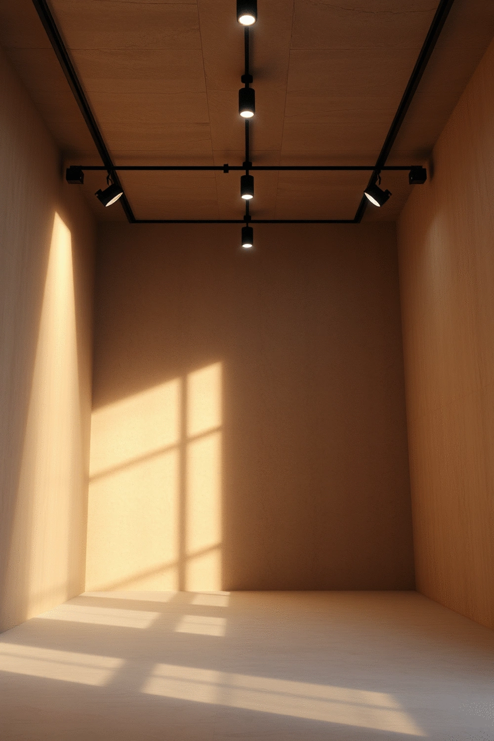
Advanced Techniques for Optimizing Lighting and Wall Colors
Combining Different Lighting Types for Enhanced Art Displays
The way light interacts with color can significantly alter how we perceive both wall colors and artwork. To achieve the best results:
- Use a mix of ambient, task, and accent lighting to highlight your art pieces.
- Consider adjustable lighting options that allow you to change the mood of the room based on the time of day.
- Test how your wall colors look under different lighting to ensure they complement your artwork beautifully.
In my experience, the right lighting can transform a space, making colors feel more vibrant and inviting. For more lighting tips, see this guide on bedroom lighting ideas for relaxing sleep.
Considerations for Natural vs. Artificial Light
Understanding how natural and artificial light affects wall colors is essential for achieving the desired effect. Here are some tips:
- Observe how wall colors appear in different lighting throughout the day.
- Use warm LED lights for a cozy atmosphere, while cooler lights can enhance modern decor.
- Test paint swatches in various lighting conditions before making a final decision.
Trust me; natural light can bring out the hidden nuances in color that artificial lighting might not capture!
Using Texture and Color for a Multifaceted Experience
Texture plays a crucial role in how we perceive wall colors. Consider these techniques:
- Incorporate textured wallpaper or fabric to add depth and interest.
- Mix matte and glossy finishes to create a dynamic visual experience.
- Utilize textured decor elements, such as woven baskets or wooden frames, to complement your wall colors.
In my designs, I always find that adding texture along with color creates an engaging environment that captivates visitors.
Recap of Key Points
Here is a quick recap of the important points discussed in the article:
- Wall Colors Influence Art Perception: The right wall color can enhance the visual appeal of artwork and create the desired atmosphere.
- Understanding Color Psychology: Colors evoke emotions and can shift the viewer's experience of art, with hues like blue promoting tranquility and red igniting passion.
- Apply Color Theory: Utilizing complementary, analogous, and triadic colors can enhance the beauty of your art pieces and create striking contrasts.
- Align Colors with Personal Style: Choose wall colors that resonate with your individual style and echo the colors present in your art collection.
- Incorporate Lighting and Texture: The interaction of light with colors and the addition of texture can significantly enhance your art display and overall space.