
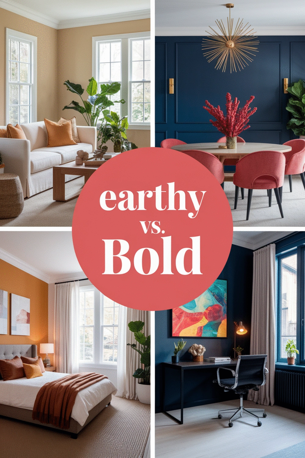
Looking to transform your living space? The right color palette can dramatically change the mood of your home. Whether you yearn for a calming sanctuary or a vibrant atmosphere, understanding earthy and bold color palettes is key to achieving your desired aesthetic.
As an Amazon Associate I earn from qualifying purchases. Affiliate links may earn me a commission at no extra cost to you.
What You Will Learn
- Earthy color palettes evoke warmth and tranquility, featuring tones like terracotta, warm browns, and deep greens.
- Bold color palettes, comprising jewel tones and high-contrast colors, are perfect for making a statement and injecting energy into a space.
- Understanding the pros and cons of each palette can help you choose the right colors based on the functionality of your rooms.
- Color theory plays a crucial role in palette selection, guiding you to combine colors that resonate emotionally and aesthetically.
Understanding Earthy and Bold Color Palettes for Your Home
Color palettes play a vital role in setting the tone of our living spaces. At Wall Art Cozy Space Vibes, we believe that understanding earthy and bold color palettes can truly elevate your home decor. Earthy palettes, for instance, consist of colors found in nature, evoking a sense of warmth and tranquility. Think of rich terracotta, warm browns, and deep greens that can bring a cozy, inviting atmosphere to any room.
These tones can create a beautiful backdrop for your wall art, making it feel like a natural extension of your environment. Imagine a gallery wall adorned with earthy hues that seamlessly integrates with the rest of your decor! In contrast, bold color palettes are all about making a statement. Let’s dive into what these vibrant selections entail.
What Are Earthy Color Palettes?
Earthy color palettes encompass a range of tones that reflect the earth's natural beauty. These colors include:
- Terracotta - a warm, clay-like hue that adds rustic charm.
- Warm browns - reminiscent of wood and soil, providing a grounded feel.
- Deep greens - evoking lush landscapes and promoting a sense of calm.
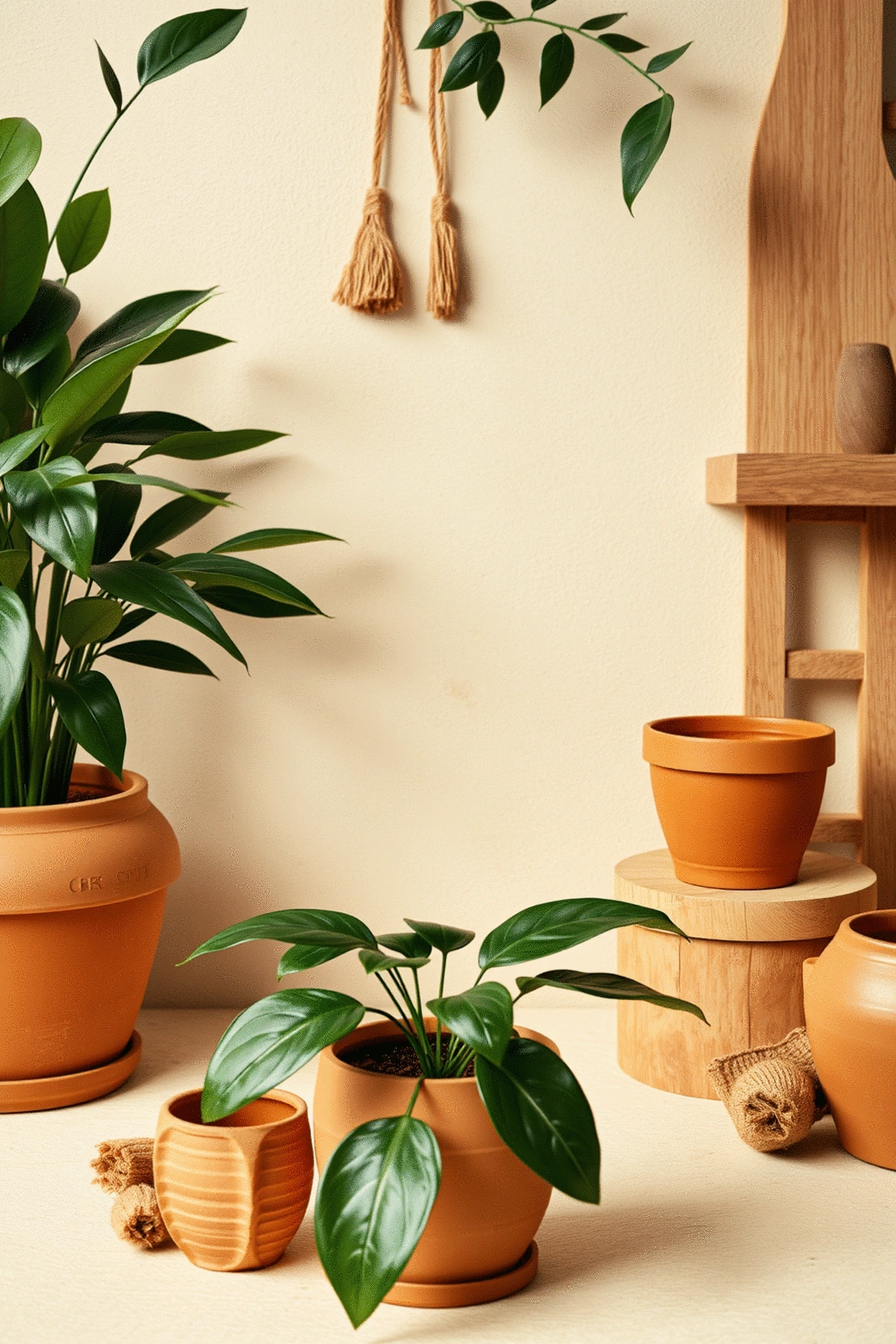
Using earthy tones can create a peaceful and cozy ambiance in your home. When combined thoughtfully with wall art, these colors can enhance the overall aesthetic. A gallery wall featuring earthy shades can truly harmonize with your space, making it feel like a personal sanctuary.
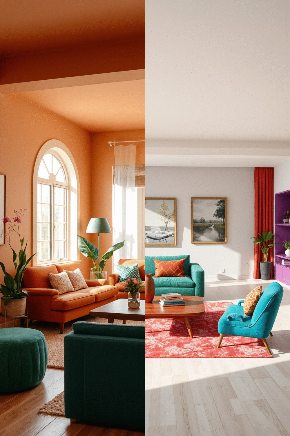
Characteristics of Bold Color Palettes
On the other hand, bold color palettes are designed to capture attention and spark energy. These palettes typically feature:
- Jewel tones such as emerald greens, sapphire blues, and rich purples, which add sophistication.
- High-contrast colors like black and white, perfect for creating striking visual interest.
- Vivid primaries that inject a playful and lively vibe into your spaces.
Incorporating bold colors into your home can dramatically transform its character. They can make a room feel vibrant and dynamic, especially when applied thoughtfully. Consider using colorful accessories or statement pieces that complement your bold palette, creating a lively atmosphere that reflects your unique style.
Comparing Earthy and Bold Color Palettes
Side-by-Side Comparison of Pros and Cons
Both earthy and bold color palettes have their advantages and disadvantages. Here’s a quick comparison to help you decide which one suits your style:
| Color Palette | Pros | Cons |
|---|---|---|
| Earthy | Creates a calming atmosphere, easily pairs with natural materials. | Can feel too muted if overused. |
| Bold | Injects energy into a space, great for showcasing personality. | Risk of overwhelming a room if not balanced with neutrals. |
When choosing between these two palettes, consider the feeling you want to evoke in the space. Both have unique characteristics that can enhance your home’s design, making it essential to select one that resonates with you.
Choosing Based on Room Functionality
Different rooms serve varying purposes, which influences the best color palette choice. For instance:
- Living Rooms: Earthy colors can create a comfortable gathering space, while bold colors can make a statement.
- Bedrooms: Earthy tones promote relaxation, whereas bold palettes might be better for an invigorating vibe.
- Kitchens: Bright, bold colors can energize the cooking space, while warm earthy tones can add warmth.
- Bathrooms: Earthy colors can create a spa-like atmosphere, while bold tones can inject personality.
By understanding how to use earthy and bold palettes according to room functionality, you can enhance both aesthetics and the overall mood of your home! For more ideas on enhancing specific spaces, explore 7 essential tips for an inviting living room.
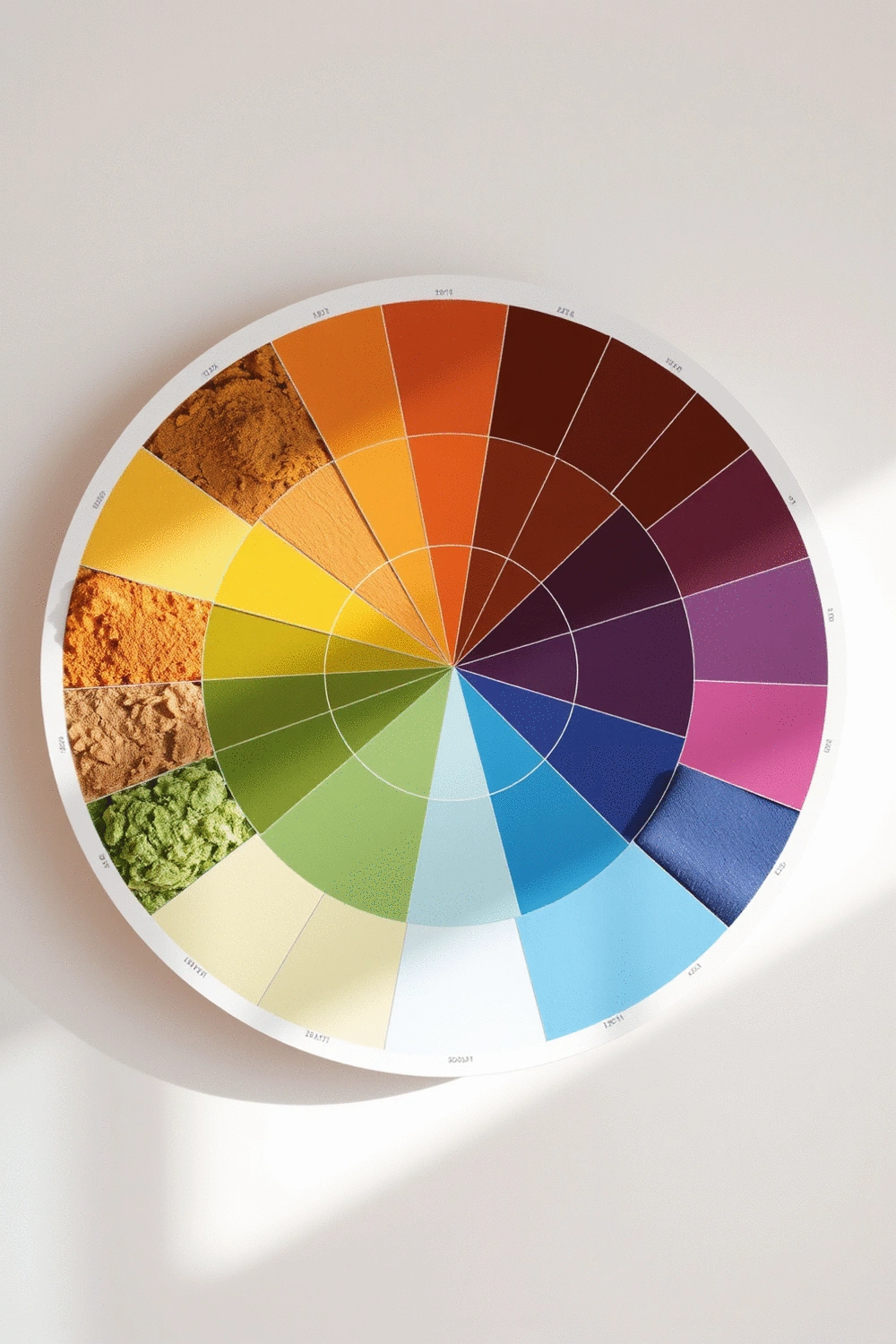
Color Theory and Its Role in Palette Selection
Color theory plays an essential role in selecting between earthy and bold palettes. Understanding the basics—like complementary colors, analogous colors, and the emotional responses they invoke—can guide your choices. For instance, earthy tones often pair well with warm neutrals, while bold colors thrive alongside contrasting shades for maximum impact.
This knowledge can be transformative as you curate your wall art and decor! If you’re eager to explore more about how color psychology impacts design, check out our post on color psychology. Remember, the right color palette can serve as the backbone of your design journey.
Summarizing Your Color Palette Choice
As we wrap up our exploration of earthy and bold color palettes, it’s essential to recognize how each can transform your home. Earthy palettes, characterized by warm tones like terracotta, soft greens, and deep browns, bring a sense of calm and grounding to your spaces. These colors are perfect for creating a cozy atmosphere that feels inviting and serene.
On the other hand, bold palettes, featuring striking jewel tones and high-contrast colors, can infuse your home with energy and personality! The vibrancy of these colors allows for dynamic expressions of style. Whether you lean towards the subtle warmth of earthy tones or the vibrant flair of bold hues, understanding their characteristics will guide you in making a choice that resonates with your personal taste.
Frequently Asked Questions About Color Palettes
- Q1: What are the main characteristics of earthy color palettes?
- A1: Earthy color palettes are inspired by nature, featuring warm tones like terracotta, various shades of brown, and deep greens. They evoke a sense of calm, warmth, and tranquility, creating a cozy and grounded atmosphere in a home.
- Q2: How do bold color palettes differ from earthy ones?
- A2: Bold color palettes are designed to make a statement and inject energy. They typically include jewel tones (e.g., emerald green, sapphire blue), high-contrast colors (like black and white), and vivid primaries to create a dynamic and vibrant space.
- Q3: When should I choose an earthy palette over a bold one for a room?
- A3: Earthy palettes are ideal for spaces where relaxation and comfort are priorities, such as bedrooms or living rooms designed for unwinding. They help create a serene and inviting atmosphere. Bold palettes are better for areas where you want to stimulate energy, showcase personality, or make a strong visual impact, like kitchens or entertainment rooms.
- Q4: Can I combine earthy and bold colors in my home decor?
- A4: Yes, you can! Combining elements from both palettes can create a balanced and dynamic look. For example, you could use an earthy base palette and introduce bold accents through wall art, textiles, or furniture to add pops of color and visual interest without overwhelming the space.
- Q5: What role does color theory play in selecting a palette?
- A5: Color theory is crucial for understanding how different colors interact and the emotional responses they evoke. It helps in selecting complementary or analogous colors that harmonize, ensuring your chosen palette achieves the desired aesthetic and mood for your space. Understanding these principles helps avoid clashes and creates cohesive designs.
Next Steps in Your Design Journey
Now that you’ve considered both palettes, take a moment to reflect on your personal style and the functionality of each room in your home. Ask yourself: How do you want each space to feel? Is it cozy and tranquil, or lively and energizing? By establishing your priorities, you can create a decision-making framework that helps you select colors that align with your vision.
I encourage you to share your color palette preferences in the comments! If you're feeling unsure, don't hesitate to seek professional advice to help you navigate your choices. Remember, I'm here to support you in creating a home that reflects your unique style and comfort.
Lastly, for additional insights, check out my post on color psychology and how it can enhance your living space. I also recommend reading about harmonizing your color palette for open-plan living, which can help you make cohesive design choices throughout your home! For more inspiration on making your home truly inviting, don't miss our guide on 10 master bedroom design ideas for cozy serenity.
Recap of Key Points
Here is a quick recap of the important points discussed in the article:
- Earthy Color Palettes: Comprise terracotta, warm browns, and deep greens that create a calming and cozy atmosphere.
- Bold Color Palettes: Feature jewel tones and high-contrast colors that energize spaces and showcase personality.
- Room Functionality: Choose colors based on the purpose of the room—earthy tones for relaxation in bedrooms, bold colors for energy in kitchens.
- Color Theory: Understanding color combinations helps in palette selection; earthy tones pair well with neutrals while bold colors thrive on contrast.
- Personal Style: Reflect on your style and room functions to create a harmonious and inviting space that resonates with you.