Did you know that the colors you choose for your living space can significantly influence your mood and overall atmosphere? Understanding color harmony is essential for turning your home into an inviting retreat.
As an Amazon Associate I earn from qualifying purchases. Affiliate links may earn me a commission at no extra cost to you.
What You Will Learn
- The significance of a harmonious color palette in open-plan living spaces.
- How color choices can enhance visual balance and emotional tone within a home.
- Practical strategies for creating visual flow using color in open areas.
- Key principles of color psychology and their impact on mood and ambiance.
- Essential steps to achieve a cohesive color scheme using the 60-30-10 rule.
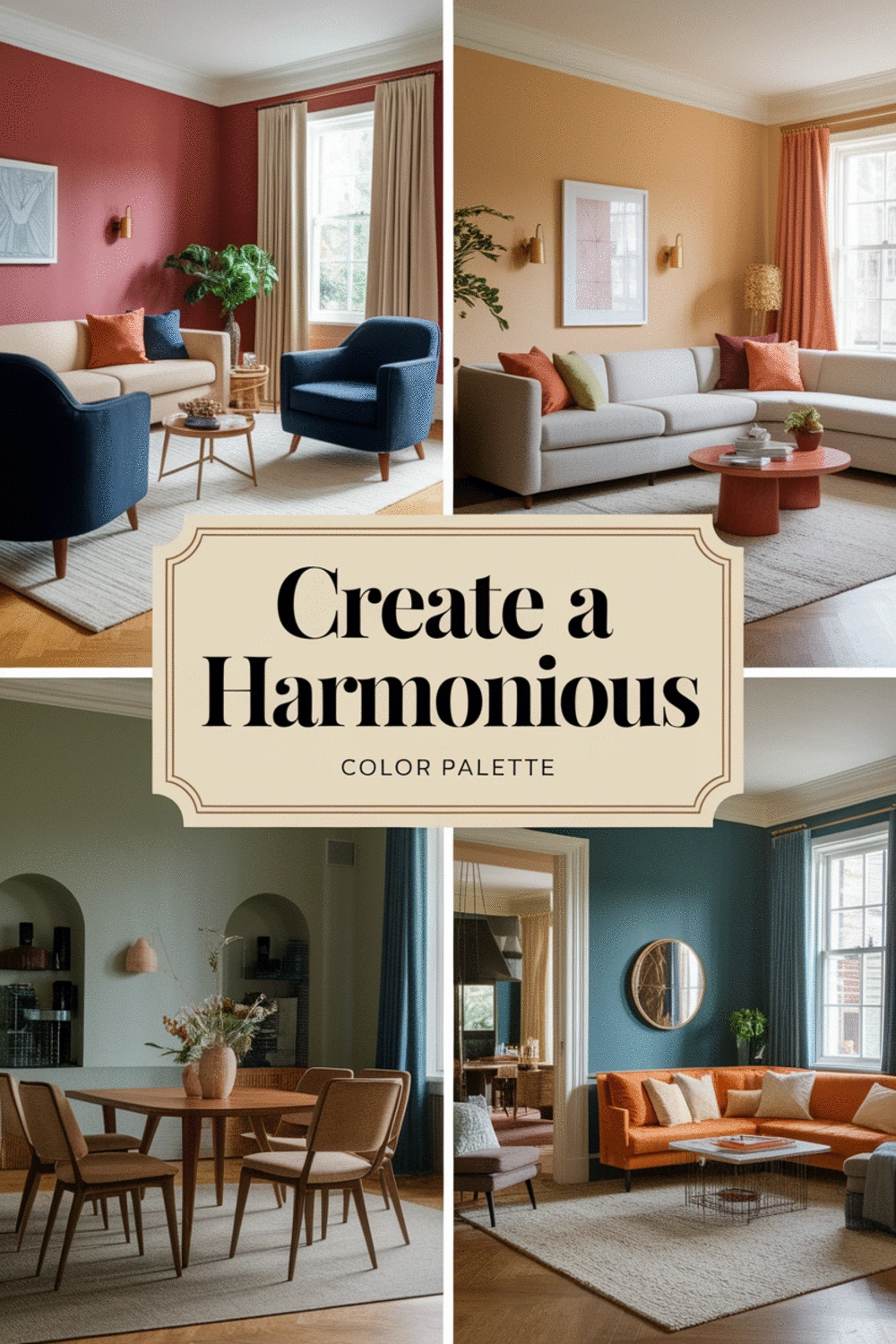
Understanding the Importance of a Harmonious Color Palette in Open-Plan Living
When it comes to open-plan living spaces, the right color palette is essential for creating a cohesive and inviting atmosphere. I often find that homeowners underestimate how color can transform their environments. Whether you're setting a mood for relaxation or energizing your social space, color harmony plays a pivotal role in achieving your desired vibe.
Colors aren’t just about looks; they can influence feelings and perceptions. That’s why understanding the importance of a harmonious color scheme is the first step in designing a beautiful open-plan area. Let's dive deeper into why color harmony matters and how it contributes to the overall feel of your living space.
Why Color Harmony Matters for Open Concept Spaces
In open-plan layouts, each area flows into the next, making it vital for colors to work together. When you have a consistent color palette, it creates a sense of unity throughout the space. Here are a few reasons why color harmony is crucial:
- Enhances visual balance across different areas.
- Creates a seamless transition from one space to another.
- Sets the emotional tone of the entire home.
By choosing colors that complement each other, you maintain a visual connection throughout your home, making it feel cohesive and thoughtfully designed. For more tips on creating inviting spaces, check out 7 Essential Tips for an Inviting Living Room.
The Role of Color in Creating Visual Flow
Color can guide the eye through your open space, establishing a natural flow that enhances functionality. For instance, using similar hues in adjacent areas can visually link them, making the space feel larger and more inviting. Think of it as a color pathway that leads guests (and you!) through your home.
To create this effect, consider these strategies:
- Use a dominant color throughout the main areas.
- Incorporate accents in smaller spaces to add interest.
- Match colors in furniture and décor for relatable themes.
When executed well, color can transform your open-plan living into a harmonious retreat!
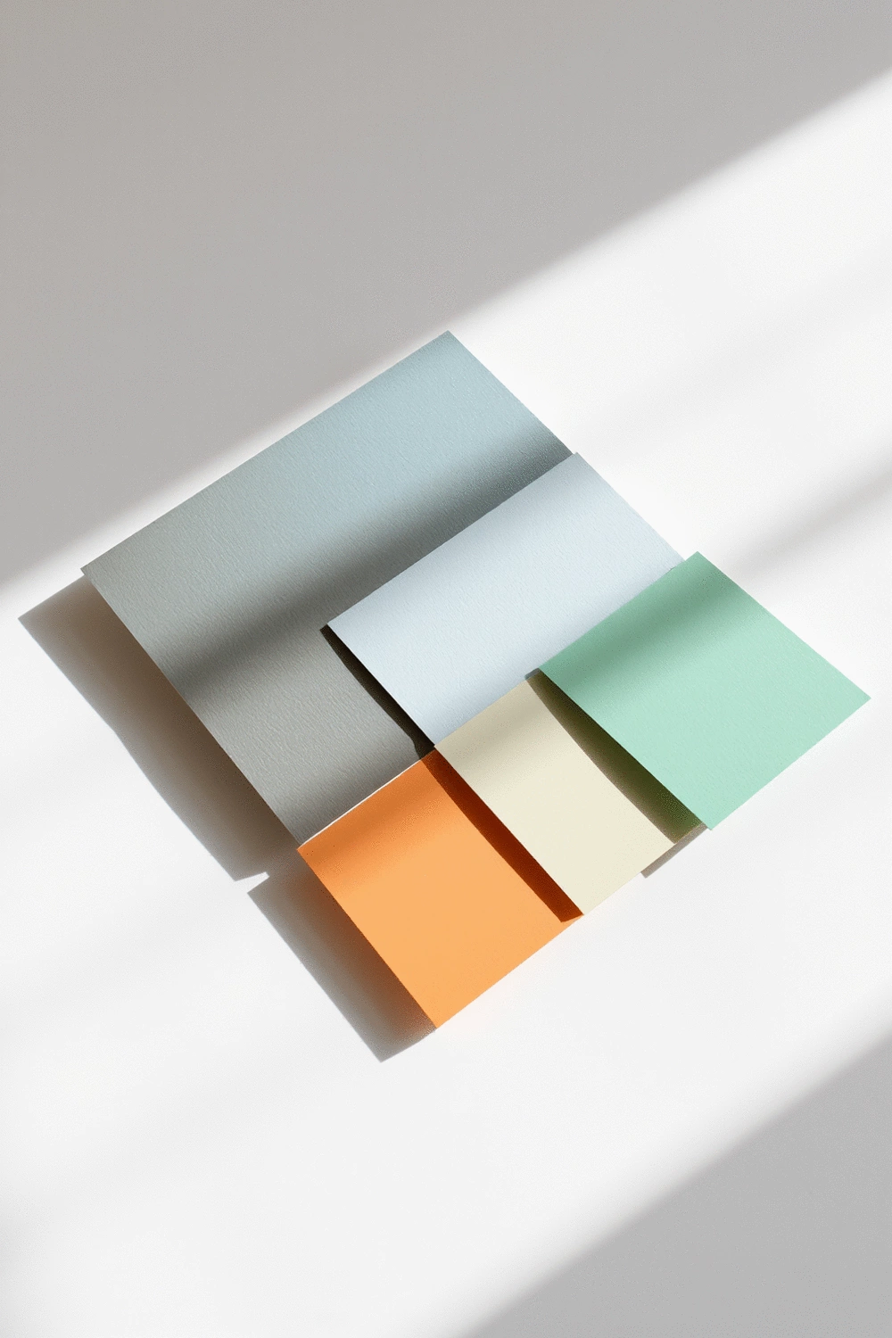
Exploring Color Psychology and Its Impact on Mood
Colors evoke emotions, which can significantly impact how we feel in our homes. Understanding color psychology is essential for selecting a palette that aligns with your desired atmosphere. For example:
- Blues: Promote calm and tranquility, perfect for a cozy living room.
- Yellows: Infuse energy and cheerfulness, ideal for dining or social areas.
- Greens: Represent balance and nature, creating a refreshing vibe.
By incorporating colors that resonate with you, you can create a space that feels like home. I love reading about new trends, like those outlined in my post on the best color palettes for a cozy living room in 2025. It's a great resource for further inspiration on how to harmonize your colors beautifully!
Summarizing Key Steps to Achieve Color Harmony
As we dive into the world of color, it's vital to remember a few key principles that can help us achieve a harmonious palette in our open-plan spaces. Understanding the importance of color harmony not only elevates the aesthetic but also creates a soothing atmosphere in our homes. Here are some essential steps to consider:
- Identify a cohesive color scheme: Take into account the mood you want to evoke in your space.
- Utilize the 60-30-10 rule: This classic rule guides you to allocate 60% of a dominant color, 30% of a secondary color, and 10% of an accent color in your design.
- Experiment with color variations: Incorporate tints and shades of your chosen colors to add depth and interest.
Remember, personal expression plays a significant role in making a space truly yours! When selecting colors, think about how you want them to reflect your personality and lifestyle.
FAQs About Color Harmony
- Q: What is color harmony in open-plan living spaces?
- A: Color harmony refers to the thoughtful selection and arrangement of colors that work well together to create a cohesive, balanced, and aesthetically pleasing environment throughout an open-plan area.
- Q: How does color influence mood in a home?
- A: Colors have psychological effects; for example, blues can promote calm, yellows can add energy, and greens can create a refreshing feel. Choosing colors that align with desired emotions helps set the overall mood of a space.
- Q: What is the 60-30-10 rule for interior design?
- A: The 60-30-10 rule is a guideline for balancing colors in a room: 60% of the space should be a dominant color, 30% a secondary color, and 10% an accent color. This creates visual balance and interest.
- Q: How can I create visual flow with color in an open space?
- A: To create visual flow, use a dominant color consistently across main areas, incorporate accent colors in smaller zones, and match colors in furniture and decor to visually link different parts of the open plan.
- Q: Should I hire a professional designer for color palette selection?
- A: This depends on your comfort level and vision. DIY is great for those who enjoy experimenting, while a professional designer offers expert guidance for a polished look. A hybrid approach (designer for layout, DIY for colors) is also an option.
Final Thoughts on Personalizing Your Open-Plan Space
When it comes to designing your open-plan area, personalization is key! Embrace your unique style and let it guide your color selections. Consider incorporating elements that resonate with your passions and experiences—like a vibrant piece of art or a cherished decorative item. These touches will make your space feel inviting and authentic.
Also, don’t forget that the colors you choose can significantly influence your mood. So, whether you gravitate towards soft pastels for tranquility or bold hues for energy, ensure they align with how you want to feel in your home. For further help on picking the right colors, you might find my guide on choosing the perfect color scheme for your bedroom gallery wall useful!
Encouraging Implementation of Your Ideal Color Palette
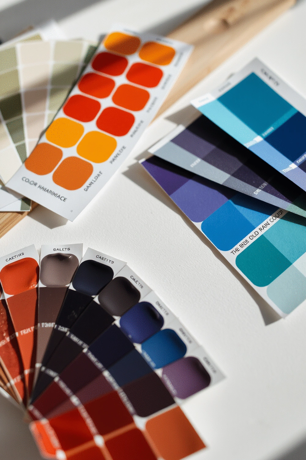
Engagement Tips: Tools and Resources for Color Palette Creation
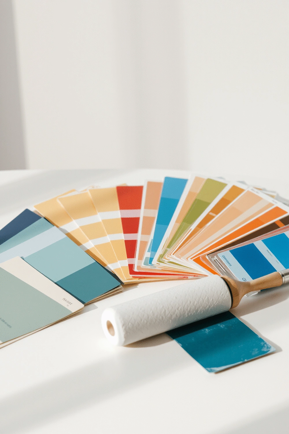
As you embark on your color journey, there are several tools and resources available to help you create the perfect palette. Here are some of my favorites:
- Color Wheel Apps: Use these to experiment with color combinations and see how they interact.
- Mood Board Creators: Visualize your ideas by collecting images, colors, and textures.
- Sample Paint Colors: Test swatches in your space to see how they look in different lighting conditions.
These resources can help you feel more confident as you work towards a beautiful and cohesive design.
Invitation to Share Your Color Palette Journey
I would love to hear about your color palette experience! Have you created a striking combination that transformed your space? Feel free to share your thoughts, tips, or even photos in the comments. Your insights can inspire others on their decorating journey!
Professional Designers vs. DIY Projects: Finding Your Balance
Deciding whether to take the DIY route or hire a professional designer can be challenging. Here are some considerations to keep in mind:
- DIY Projects: Great for those who love to experiment and have a clear vision.
- Professional Designers: Ideal for individuals seeking expert guidance and a more polished look.
- Hybrid Approach: Many homeowners find success in combining both methods—starting with a designer for layout and then tackling color choices themselves.
Ultimately, whether you choose to go it alone or seek professional help, remember that your space should reflect your personality and make you feel at home. Happy decorating! To ensure a truly peaceful sleep space, consider exploring 10 Essential Tips to Create a Peaceful Sleep Space. 🌿
Recap of Key Points
Here is a quick recap of the important points discussed in the article:
- Color Harmony: A cohesive color palette enhances visual balance and creates a seamless transition between spaces.
- Visual Flow: Utilize a dominant color throughout main areas and incorporate accents to guide the eye and enhance space functionality.
- Color Psychology: Different colors evoke specific emotions; choose hues that align with the desired atmosphere of your home.
- 60-30-10 Rule: Allocate 60% of a dominant color, 30% of a secondary color, and 10% of an accent color for a well-balanced design.
- Personal Expression: Reflect your unique style through color choices and decor elements that resonate with your experiences.