
Color can significantly transform a space, creating an inviting and harmonious atmosphere. By understanding color flow, you can elevate your home’s aesthetic and enhance your daily living experience. Here’s a glimpse into what you’ll learn about integrating color in your interior design.
As an Amazon Associate I earn from qualifying purchases. Affiliate links may earn me a commission at no extra cost to you.
What You Will Learn
- The importance of visual harmony in creating a cohesive look across different areas of your home.
- How smooth color transitions can guide the eye and enhance the overall visual experience.
- The impact of color on mood and space perception, helping you choose hues that align with your desired atmosphere.
- Tips for selecting a neutral color base to provide versatility in your decor choices.
- The benefits of incorporating a core palette of 3 to 5 colors for visual consistency.
- Strategies for using accent colors effectively to add depth and interest to your spaces.
- How to explore complementary colors for a dynamic and balanced design.
Understanding the Importance of Color Flow in Interior Design
When it comes to creating inviting spaces in our homes, understanding color flow is key. A seamless flow not only enhances the beauty of your interior but also brings harmony to your overall design. Imagine walking through a home where the colors sing together, creating a cohesive atmosphere that feels warm and welcoming. It’s all about how colors transition from one room to another and how they complement each other!
As the creative mind behind Wall Art Cozy Space Vibes, I find that a well-executed color flow can truly transform your living space into a cozy retreat. It’s about crafting an environment that isn't just visually appealing, but also feels good to live in. Let’s dive deeper into why a seamless color flow is so essential.
Why a Seamless Color Flow Enhances Your Space
A seamless color flow can elevate your home’s aesthetic by creating a sense of connection between different areas. Here are a few reasons why it matters:
- Visual Harmony: A consistent color palette across your space unifies the look, making it feel more intentional.
- Enhanced Transition: Smooth transitions help guide the eye from one room to the next, providing a pleasant visual experience.
- Increased Space Perception: Cohesive colors can make spaces feel larger and more open, which is particularly beneficial in smaller homes.
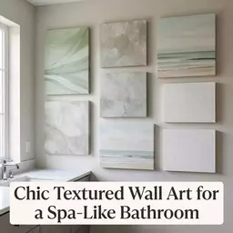
By ensuring that your rooms flow together color-wise, you're not just decorating; you're creating an experience that reflects your personality and invites others in. For more tips on choosing colors that create a cozy atmosphere, check out my post on color psychology!
How Color Flow Impacts Mood and Perception
The way colors interact in your home can significantly affect your mood and the perception of space. Different hues evoke various feelings—warm tones like reds and oranges can energize a room, while cool tones like blues and greens create a calming effect. Understanding this can help you make choices that align with the vibe you want to achieve!
For instance, pairing a soft blue in the living room with gentle yellows in the adjoining dining area creates a tranquil yet cheerful environment. This approach nurtures a feeling of peace and connection throughout your home. If you're curious about how to achieve the perfect color scheme for your gallery wall, be sure to read my post on choosing perfect color schemes!
The Role of Color Psychology in Interior Design Choices
Color psychology plays a crucial role in our design choices and influences how we feel in our environments. For example, yellow is often associated with happiness and warmth, making it an excellent choice for spaces where you entertain guests. Conversely, a deep navy blue can evoke feelings of calm and stability, ideal for bedrooms or meditation spaces.
By considering how colors impact mood and behavior, you can select hues that not only match your style but also enhance your daily living. This thoughtful approach can elevate your designs to create spaces that truly resonate with those who inhabit them. If you want to explore more about color combinations, you might enjoy my insights on mixing and matching colors!
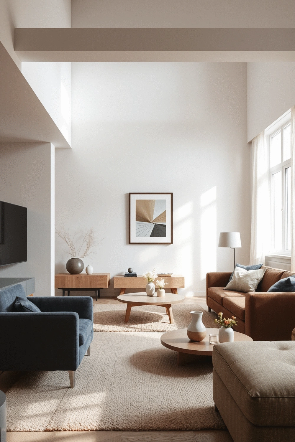
Creating a Cohesive Color Palette Across Your Home
When it comes to designing your living spaces, creating a cohesive color palette is essential for achieving a harmonious look. As I often say, think of your home as a beautiful painting where each room is a different stroke, yet together, they form a stunning masterpiece! Establishing a consistent color scheme across your home not only enhances the aesthetic appeal but also fosters a sense of unity throughout your various spaces.
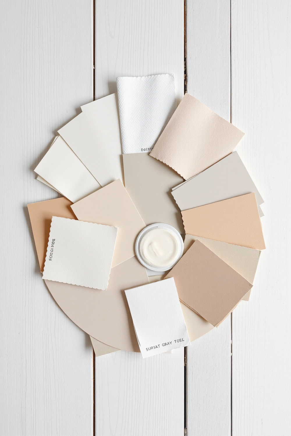
Selecting a Neutral Color Base for Versatility
Starting with a neutral color base is a smart choice for any home. Neutrals create a versatile backdrop that allows for various decor styles and accent colors to shine through. Here are some ideal neutral shades to consider:
- Soft whites
- Warm grays
- Gentle beige
- Muted taupes
These colors not only provide a calming atmosphere but also make it easy to switch up your decor with seasonal colors or vibrant accents. You can find more tips on choosing the perfect neutral colors in my post about top neutral wall colors.
Incorporating 3–5 Core Colors for Visual Consistency
Next, consider incorporating a core palette of 3 to 5 colors that resonate with your personal style. This selection often includes:
- A primary color
- Two complementary colors
- One or two accent colors
By limiting your palette, you can maintain visual consistency across your home, creating a flow that feels intentional and curated. For instance, if you choose a soft blue as your primary color, pair it with warm tans and a pop of mustard yellow for an inviting vibe. This approach ensures that every room feels connected while allowing for personal expression!
For more ideas on creating inviting spaces, check out how to create an inviting living room for guests. You might also find inspiration in 10 master bedroom design ideas for cozy serenity.
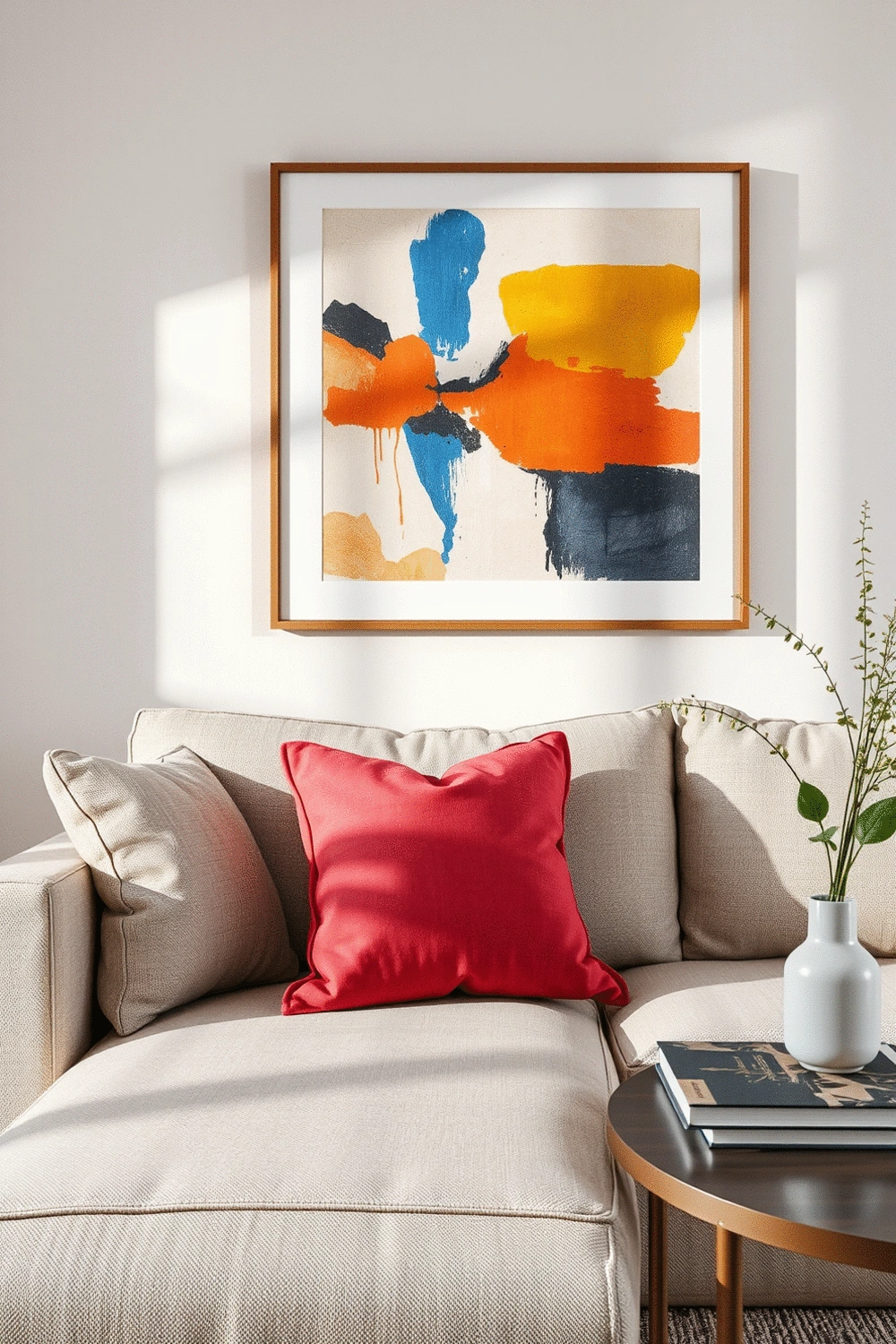
Using Accent Colors to Add Depth and Interest
Accent colors are your opportunity to introduce excitement into your color scheme! These are typically bolder hues that can be used in smaller doses to create contrast and draw the eye. Here are some ways to effectively use accent colors:
- Incorporate them through art pieces, such as vibrant prints or wall sculptures.
- Add accent pillows or throws in your chosen colors to enhance seating areas.
- Use decorative items or furniture pieces, like a bright chair or an eye-catching vase.
Remember, the key is to balance your accents with the overall color scheme to ensure a cohesive look. If you want to explore more about integrating accent colors, check out my guide on using accent colors for stylish decor!
Exploring Complementary Colors for Balanced Design
Finally, don’t shy away from playing with complementary colors to enhance your design. Complementary colors, or colors opposite each other on the color wheel, create dynamic visual interactions that can elevate your space. For example, a serene blue accent can beautifully contrast with a warm orange, bringing balance and energy into a room.
To ensure these bold choices work harmoniously, consider the proportions of each color used. A good rule of thumb is to use one color as the majority and the other as a striking highlight. This way, you can achieve a beautifully balanced design that feels both vibrant and cozy!
Frequently Asked Questions About Color Flow in Interior Design
What is color flow in interior design?
Color flow refers to the seamless transition of colors from one room to another within a home, creating a cohesive, harmonious, and visually appealing atmosphere. It involves selecting colors that complement each other and guide the eye smoothly through different spaces.
Why is a seamless color flow important for a home?
A seamless color flow is important because it enhances visual harmony, makes transitions between rooms pleasant, and can increase the perception of space, making rooms feel larger and more open. It also helps unify the home's aesthetic, making it feel more intentional and welcoming.
How do colors impact mood and perception in a home?
Colors significantly impact mood and perception. Warm tones (like reds and oranges) can energize a room, while cool tones (like blues and greens) create a calming effect. Understanding color psychology allows designers to choose hues that evoke desired feelings and align with the intended atmosphere of each space.
What is a good starting point for creating a cohesive color palette?
A good starting point is to select a neutral color base (e.g., soft whites, warm grays, gentle beige, muted taupes) for versatility. Neutrals provide a calming backdrop that allows various decor styles and accent colors to shine through and make it easy to update your decor.
How many core colors should I use for visual consistency?
It's generally recommended to incorporate a core palette of 3 to 5 colors for visual consistency. This typically includes a primary color, two complementary colors, and one or two accent colors. Limiting your palette helps maintain a cohesive and curated look throughout your home.
How should accent colors be used effectively?
Accent colors should be used in smaller doses to add depth and interest. They can be incorporated through art pieces, accent pillows or throws, and decorative items or furniture. The key is to balance them with the overall color scheme to ensure a cohesive look rather than an overwhelming one.
Recap of Key Points
Here is a quick recap of the important points discussed in the article:
- Visual Harmony: Establishing a consistent color palette unifies your home's aesthetic, creating a cohesive and intentional look.
- Enhanced Mood: Different hues impact feelings; warm tones energize while cool tones promote calm, influencing the atmosphere of each space.
- Cohesive Color Palette: Start with a neutral base and incorporate 3-5 core colors to maintain visual consistency across rooms.
- Accent Colors: Use bolder hues in small doses to add depth and interest, ensuring they complement your overall color scheme.
- Complementary Colors: Explore colors opposite on the color wheel to create dynamic interactions and balance within your design.