As we approach 2025, the world of interior design is set to experience a vibrant shift in color trends. Are you ready to refresh your living space with new hues? The upcoming year promises exciting palettes that cater to diverse tastes and styles, making it essential to stay informed. Let's dive into the key themes shaping the aesthetic landscape!
As an Amazon Associate I earn from qualifying purchases. Affiliate links may earn me a commission at no extra cost to you.
What You Will Learn
- Bold palettes featuring electric blues and neon colors will dominate interior design, perfect for making striking statements.
- Earthy tones like Alpine Oat and Mocha Mousse will evoke warmth and tranquility, ideal for creating cozy spaces.
- Dynamic gradients combined with muted neutrals will balance vibrant decor, enhancing visual appeal without overwhelming.
- Pantone's color forecasting will influence trends, emphasizing colors that promote well-being and emotional connection.
Understanding the Color Trends of 2025: Key Themes and Influences
As we step into 2025, the world of interior design is brimming with exciting color trends that promise to invigorate our living spaces! At Wall Art Cozy Space Vibes, we’re passionate about helping you embrace these vibrant themes. Let's explore the key trends that are set to shape the aesthetic landscape of the coming year.
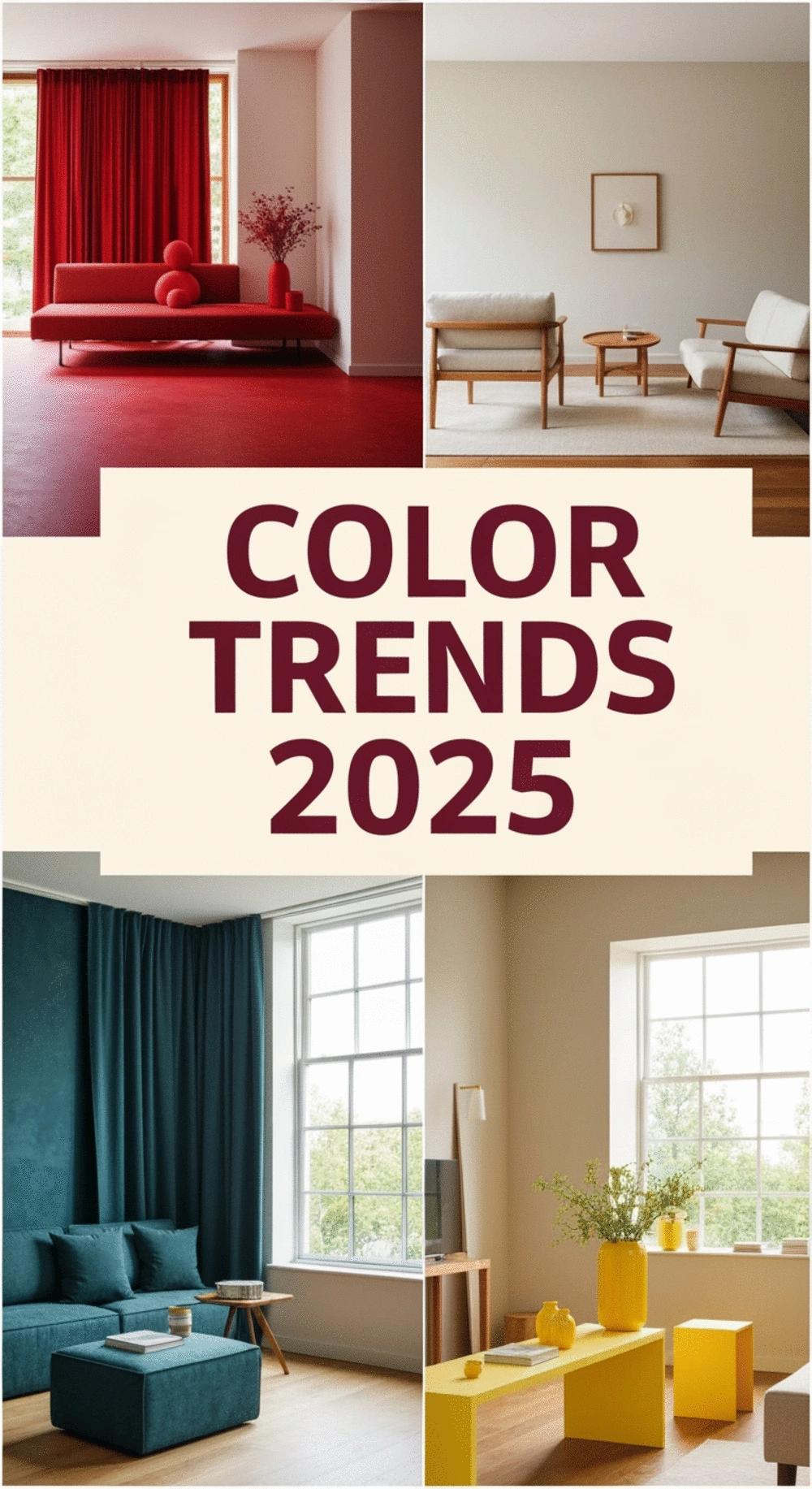
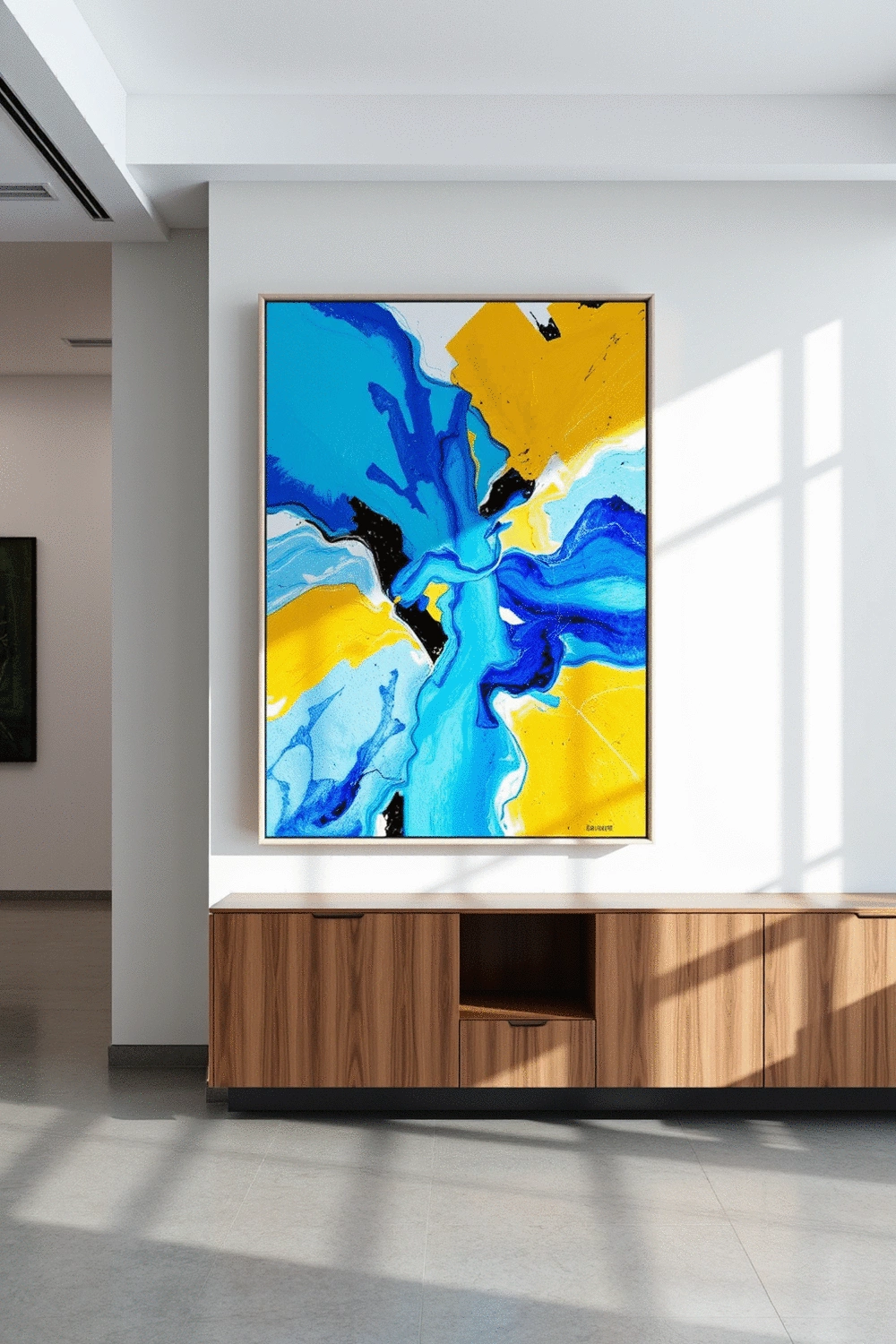
Anticipating Bold Palettes: Electric Blues and Neon Colors
The bold hues of electric blues and neon colors are making a splash in 2025! These vibrant shades are perfect for those looking to make a statement in their home decor. Imagine a gallery wall adorned with bright art pieces that instantly catch the eye. Neon colors can add a playful touch, creating a lively atmosphere that reflects personal style.
- Electric blue accents can serve as focal points in your designs.
- Neon colors work beautifully for modern and eclectic styles.
- Pair these bold shades with more muted tones for balance.
These exciting palettes not only energize a room but also invite conversation. As you consider your design choices for the year, think about how these colors can be incorporated into your own home style.
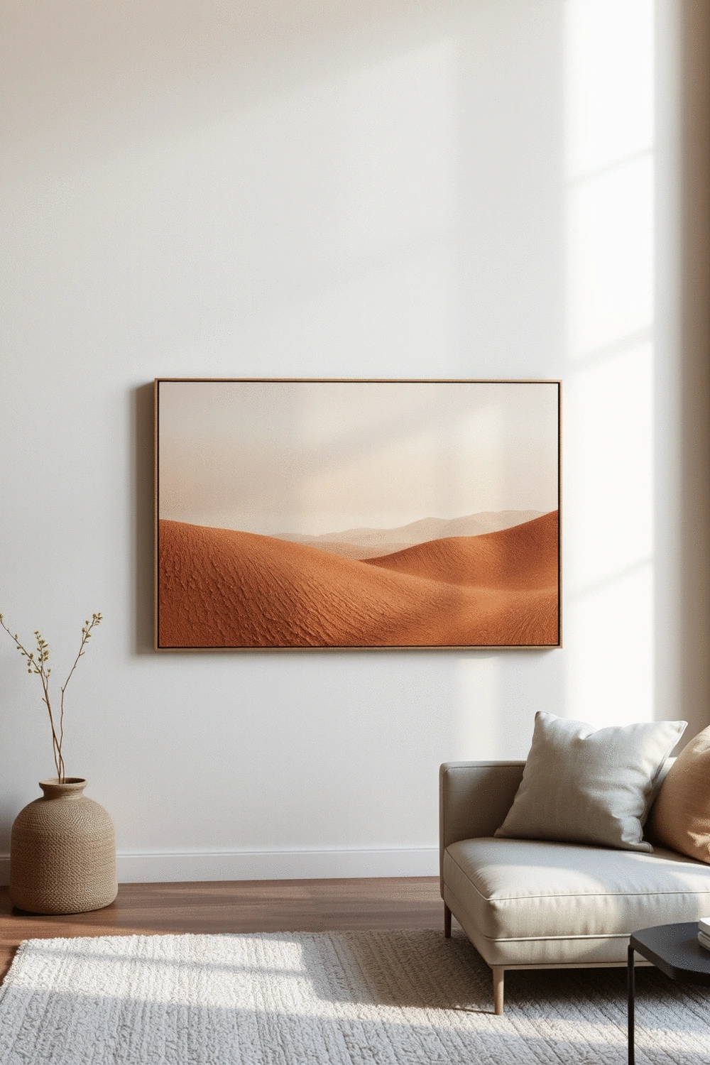
Earthy and Nature-Inspired Tones: The Rise of Alpine Oat and Mocha Mousse
On the other end of the spectrum, earthy tones like Alpine Oat and Mocha Mousse are gaining popularity. These colors evoke a sense of warmth and calm, making them ideal for creating cozy environments. These shades are perfect for complementing natural textures and materials in your decor.
- Alpine Oat brings a soft, neutral backdrop that pairs well with bolder accents.
- Mocha Mousse adds depth and sophistication, perfect for living rooms or bedrooms.
- Incorporate these tones into your wall art for a cohesive look.
Using these nature-inspired colors can create a nurturing atmosphere in your home. Check out our post on 2025 trending paint colors to see how these shades can enhance your space. For more inspiration on creating cozy atmospheres, you might find useful tips on how to use textures and fabrics for an inviting home.
Dynamic Gradients and Muted Neutrals: Balancing Vibrancy with Subtlety
As we look to 2025, dynamic gradients and muted neutrals are also on the rise. These gradients can smooth the transition between bold colors, allowing for an expressive yet harmonious blend. Adding muted neutrals provides a grounding effect, ensuring the vibrancy doesn’t overwhelm your space.
- Consider incorporating gradient wall art to showcase this trend.
- Muted neutrals can help balance out bold decor choices.
- Play with different textures to make gradients pop.
This thoughtful approach to color can help you create visually stunning designs that feel inviting and cozy. Your walls can tell a story, reflecting a beautiful blend of vibrancy and comfort.
Color Forecasting for 2025: What Trends to Expect from Pantone
Pantone’s color forecasting always sets the tone for the year ahead. For 2025, we can expect a mix of bold and soothing tones that resonate with contemporary design trends. They emphasize sustainability and emotional connection, urging us to choose colors that not only look good but also feel good in our spaces.
- Look for a blend of both bold and earthy tones in their selections.
- Emphasis on colors that promote wellbeing and positivity.
- Expect new shades that blend tradition with modernity.
Keeping an eye on Pantone’s predictions can inspire your wall art choices, helping you stay ahead of trends and design stunning environments that truly reflect who you are.
Frequently Asked Questions About 2025 Color Trends
- What are the dominant color trends for interior design in 2025?
- The dominant color trends for 2025 include bold palettes like electric blues and neon colors, as well as earthy and nature-inspired tones such as Alpine Oat and Mocha Mousse. Dynamic gradients combined with muted neutrals will also be prominent.
- How can I incorporate bold colors like electric blue and neon into my home?
- You can incorporate bold colors by using them as accents, such as in wall art, throw pillows, or small decor items. They are perfect for creating focal points and adding a playful, energetic touch to modern and eclectic styles. Pairing them with muted tones can help maintain balance.
- What kind of atmosphere do earthy tones like Alpine Oat and Mocha Mousse create?
- Earthy tones like Alpine Oat and Mocha Mousse evoke warmth and tranquility, making them ideal for creating cozy and nurturing environments. They pair well with natural textures and materials, adding depth and sophistication to living rooms or bedrooms.
- How do dynamic gradients and muted neutrals work together in design?
- Dynamic gradients help smooth the transition between bold colors, creating an expressive yet harmonious blend. Muted neutrals provide a grounding effect, preventing vibrancy from overwhelming the space and ensuring a balanced, visually appealing design.
- What role does Pantone play in 2025 color forecasting?
- Pantone's color forecasting sets annual trends, influencing designers to choose colors that promote well-being and emotional connection. For 2025, they are expected to highlight a mix of bold and soothing tones that blend tradition with modernity, emphasizing sustainability.
Summarizing Key Takeaways on 2025 Color Trends
As we look ahead to 2025, it’s clear that the color trends will be vibrant and diverse. From bold palettes featuring electric blues to earthy tones like mocha mousse, these themes are set to redefine our spaces. The interplay of dynamic gradients and muted neutrals will also provide a balance that many will find appealing in their home decor. It's fascinating to see how these colors will evoke emotions and inspire thoughtful design choices.
Here are some key takeaways to consider:
- Bold Colors: Expect to see electric blues and neon shades making waves in wall art and decor.
- Nature-Inspired Tones: Earthy shades, especially mocha mousse, will bring warmth and tranquility to interiors.
- Dynamic Gradients: Combining vibrant hues with subtle tones will create versatile and inviting atmospheres.
Understanding these trends can help you make informed decisions about your decor. If you’re curious about how to blend these colors into your living space, check out my post on earthy vs. bold color palettes for some practical ideas!
Recap of Vibrant and Earthy Color Trends
In summary, color trends for 2025 are a beautiful mix of vibrancy and earthiness. The electric blues and neon colors promise to energize spaces, while mocha mousse offers a soothing retreat. These trends are perfect for creating an inviting atmosphere in any room, whether it’s for a cozy living room or a serene bedroom. For more insights on color schemes specifically for bedrooms, you might find my guide on choosing the perfect color scheme for your bedroom gallery wall quite useful!
Understanding the Importance of Color in Branding and Consumer Behavior
As a designer, I've seen firsthand how color influences not just aesthetics but also consumer behavior. The right color can spark emotions, create trust, and even drive purchasing decisions. This is why it’s crucial to consider how these trends intersect with branding strategies. By aligning your brand identity with current color trends, you can enhance your appeal to potential customers.
Colors create a visual language that speaks volumes about a brand’s personality and values. When I designed my own brand, Wall Art Cozy Space Vibes, selecting a warm palette was key to conveying a sense of comfort and creativity. Understanding this connection can empower you to make impactful design choices that resonate with your audience.
Encouraging Action: Applying Color Trends to Your Own Projects
Practical Steps to Integrate Trending Colors in Your Designs
Now that we’ve explored the trends, let’s talk about how to apply them in your own projects! Here are some practical steps:
- Start Small: Introduce new colors through smaller decor items, like throw pillows or wall art.
- Test Swatches: Before committing to a color, paint sample swatches on your walls to see how they look in different light.
- Mix and Match: Don’t shy away from combining bold and muted tones for a balanced look.
These steps can help you confidently embrace the upcoming color trends. For a more in-depth look at creating cohesive color palettes, explore my post on creating a harmonious color palette for open-plan living!
Staying Ahead of the Curve: Embracing Future Color Innovations
Staying current with color innovations is essential in the fast-paced world of design. Keep an eye on emerging trends by following design blogs, attending workshops, or joining online communities. These resources can provide insights into future color directions, helping you stay relevant.
Remember, the goal is not just to follow trends but to infuse them with your unique style. Don't be afraid to experiment; sometimes the most beautiful designs come from unexpected color combinations! You can also find inspiring concepts for creating peaceful sleep spaces by visiting 10 Essential Tips to Create a Peaceful Sleep Space.
Color Matching Techniques for Diverse Applications
Finally, mastering color matching techniques can elevate your design projects. Here are some tips to consider:
- Use a Color Wheel: Familiarize yourself with complementary colors to enhance contrast.
- Incorporate Textures: Different textures can change how colors appear, adding depth to your designs.
- Seek Inspiration: Look at fashion, nature, and art for color pairing ideas that resonate with your style.
By applying these techniques, you can create visually stunning spaces that reflect the latest trends while feeling uniquely yours. I can’t wait to see how you incorporate these vibrant colors into your home!
Recap of Key Points
Here is a quick recap of the important points discussed in the article:
- Bold Colors: Expect to see electric blues and neon shades making waves in wall art and decor.
- Nature-Inspired Tones: Earthy shades, especially mocha mousse, will bring warmth and tranquility to interiors.
- Dynamic Gradients: Combining vibrant hues with subtle tones will create versatile and inviting atmospheres.
- Color Forecasting: Stay updated with Pantone’s predictions for a blend of bold and soothing tones in your designs.
- Practical Steps: Start small by introducing new colors through decor items, test swatches, and mix bold with muted tones.