
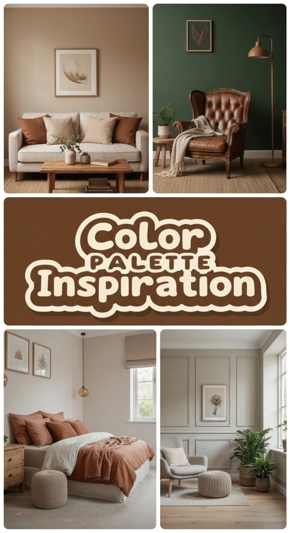
Embracing a nature-inspired color palette can rejuvenate your home and uplift your spirit! By exploring how earth tones affect mood and well-being, you can create a serene sanctuary that reflects your personal style while fostering a calming atmosphere.
As an Amazon Associate I earn from qualifying purchases. Affiliate links may earn me a commission at no extra cost to you.
What You Will Learn
- Nature-inspired color palettes enhance well-being and reduce stress through the use of soothing earth tones.
- Biophilic design encourages the selection of colors that reflect natural environments, fostering emotional connections to your space.
- Understanding color theory helps create harmonious and dynamic spaces by utilizing complementary, analogous, and triadic color schemes.
- Seasonal color adjustments can refresh your home’s atmosphere, creating a living space that evolves with nature throughout the year.
- Staying updated on color trends can elevate your decor, ensuring your space remains stylish and inviting.
Finding the Right Nature-Inspired Color Palette for Your Home
Are you ready to breathe life into your living space? Nature-inspired color palettes can transform your home into a calming haven! By harnessing earth tones and natural hues, you can create environments that not only look beautiful but also enhance your overall well-being.
Colors derived from nature, like greens and browns, have a unique ability to ground us and cultivate a sense of peace. Imagine walking into a room painted in soft greens or warm terracottas; it feels as if you’ve stepped into a serene forest or a cozy earth nook! When we incorporate these tones into our homes, we’re reminded of the outdoors, promoting a calming atmosphere.
Understanding the Benefits of Nature-Inspired Colors
- Enhances Well-Being: Natural colors uplift mood and can reduce stress.
- Creates Cohesion: Earth tones blend easily with various decor styles.
- Promotes Comfort: These colors evoke feelings of warmth and safety.
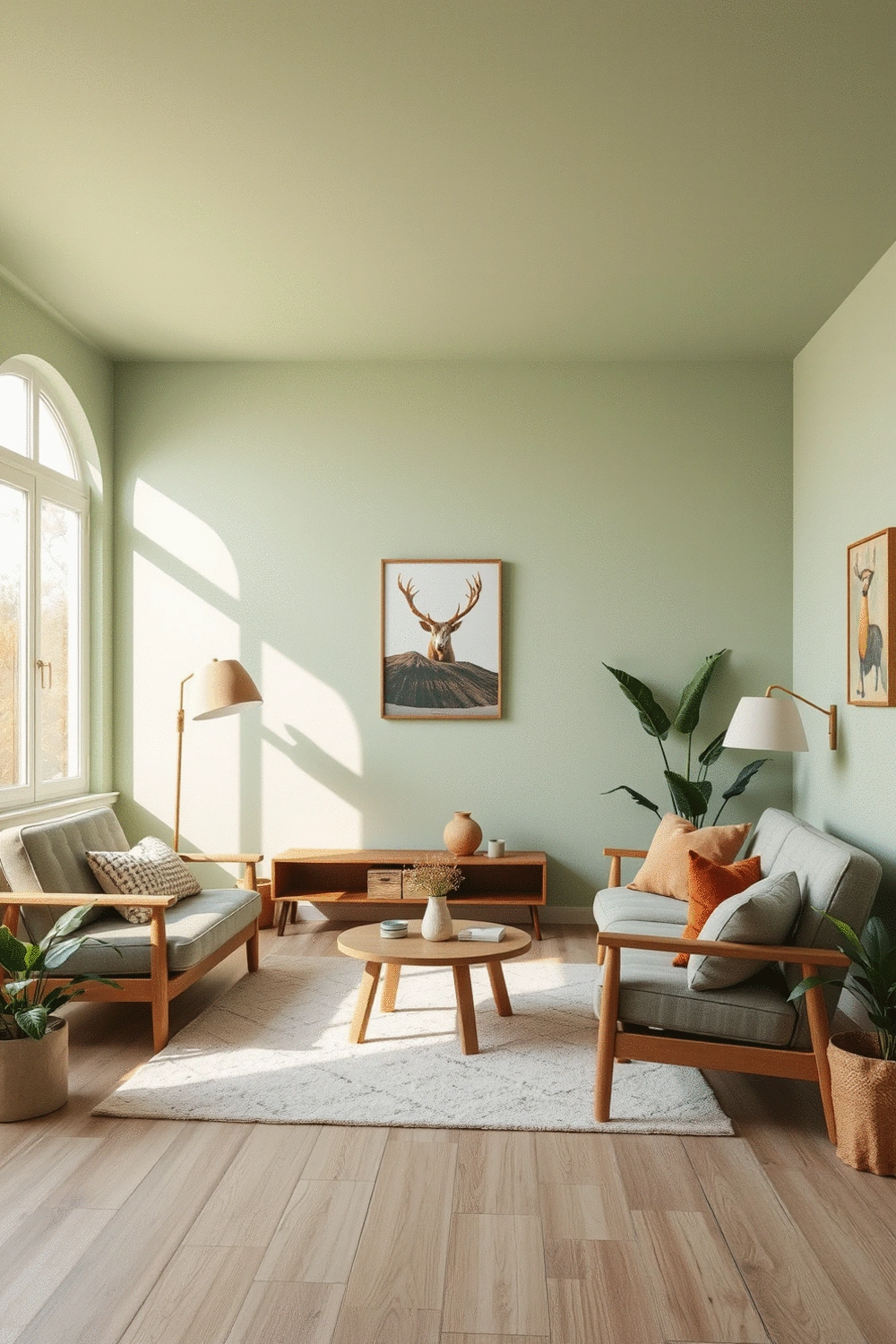
What is Biophilic Design and How Does it Influence Color Choice?
Biophilic design is all about connecting our living spaces with nature. It’s a concept I absolutely love, as it encourages the incorporation of natural elements into design, including colors. When selecting colors, think about what you might find in a lush forest or a vibrant garden!
- Natural Colors: Greens, browns, and blues mimic nature.
- Texture and Light: Consider how textures and lighting affect color perception.
- Emotional Response: Choose colors that resonate with your personal experiences in nature.
By selecting colors inspired by the environment, you create a home that feels alive and vibrant. This alignment with nature's aesthetics can significantly enhance emotional health, turning your home into a sanctuary of comfort and peace.
Color Theory: The Foundation of Nature-Inspired Design
Understanding color theory is essential when crafting a nature-inspired palette. It provides the framework for how colors interact, evoke feelings, and set the mood in a space. Start with the color wheel—it's a handy tool to visualize color relationships!
- Complementary Colors: Colors opposite each other on the wheel create vibrant contrast.
- Analogous Colors: Colors next to each other offer harmony, perfect for a serene look.
- Triadic Scheme: A balanced approach using three colors can add dynamism while maintaining a natural feel.
By exploring these principles, you can select colors that not only look good together but also enhance your home's overall ambiance. I’ve often found that readers are amazed at how simple adjustments in color can breathe new life into their walls. If you want to dive deeper into this topic, check out my post on earthy vs. bold color palettes for more insights!
Seasonal Color Palette Adjustments for Every Room
Adapting Your Color Scheme Through the Seasons
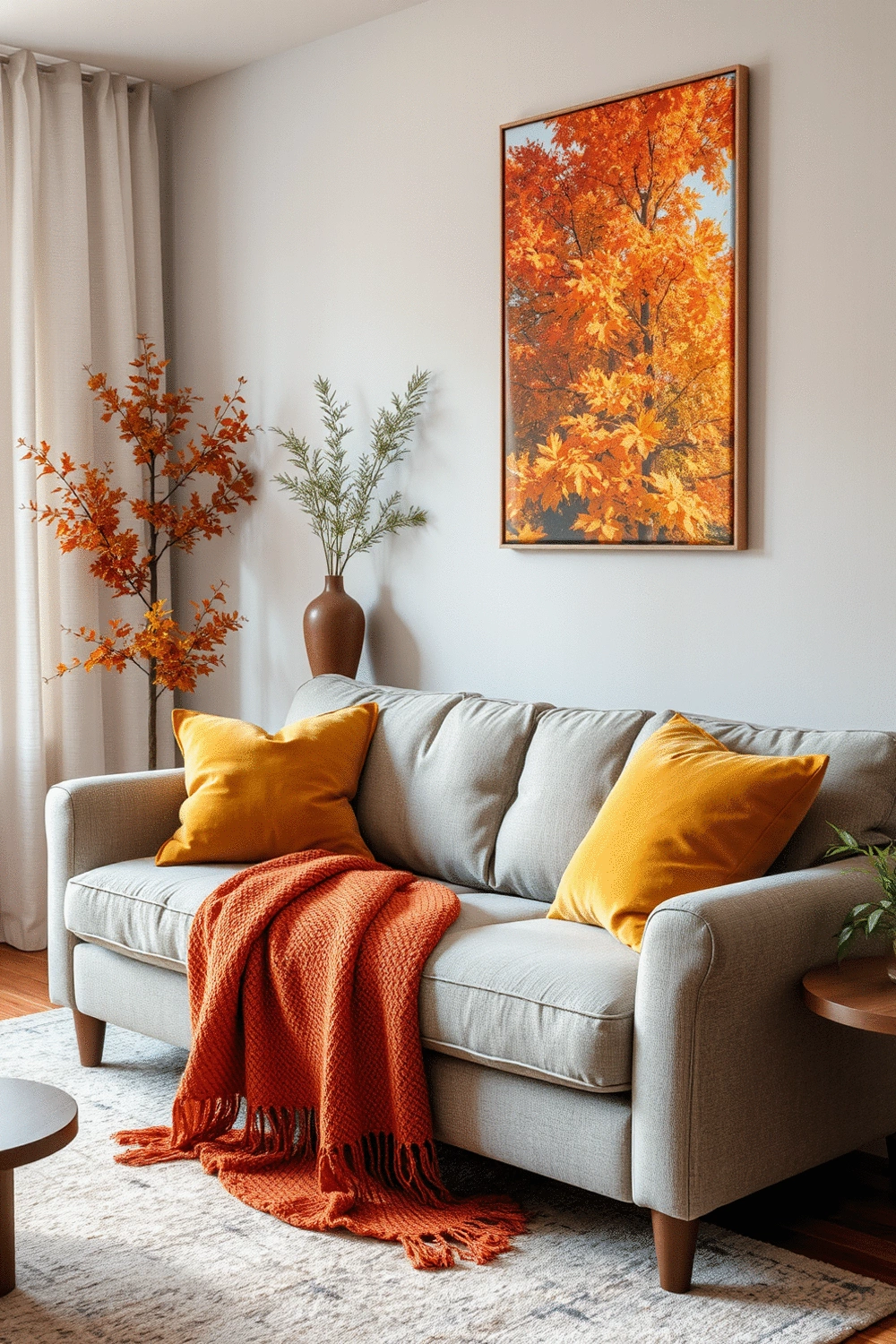
As the seasons change, so can your home’s vibe! I love the idea of refreshing your color palette without undergoing major renovations. A simple way to do this is by swapping out interchangeable accents. Think about incorporating seasonal throws, pillows, or even artwork that reflects the time of year. For instance, you might opt for warm, earthy tones in fall and switch to cool blues and whites in winter.
- Use autumn hues like rust and mustard for cozy fall decor.
- In winter, shift to icy blues and soft whites for a calming atmosphere.
- Spring can bring pastel shades such as mint and lavender for a fresh look.
- Summer is perfect for vibrant colors like coral and turquoise.
Incorporating these changes not only keeps your home feeling fresh but also aligns your space with the beauty of nature throughout the year. Want to explore more about creating a cozy vibe in your living room? Check out my post on the best color palettes for a cozy living room in 2025!
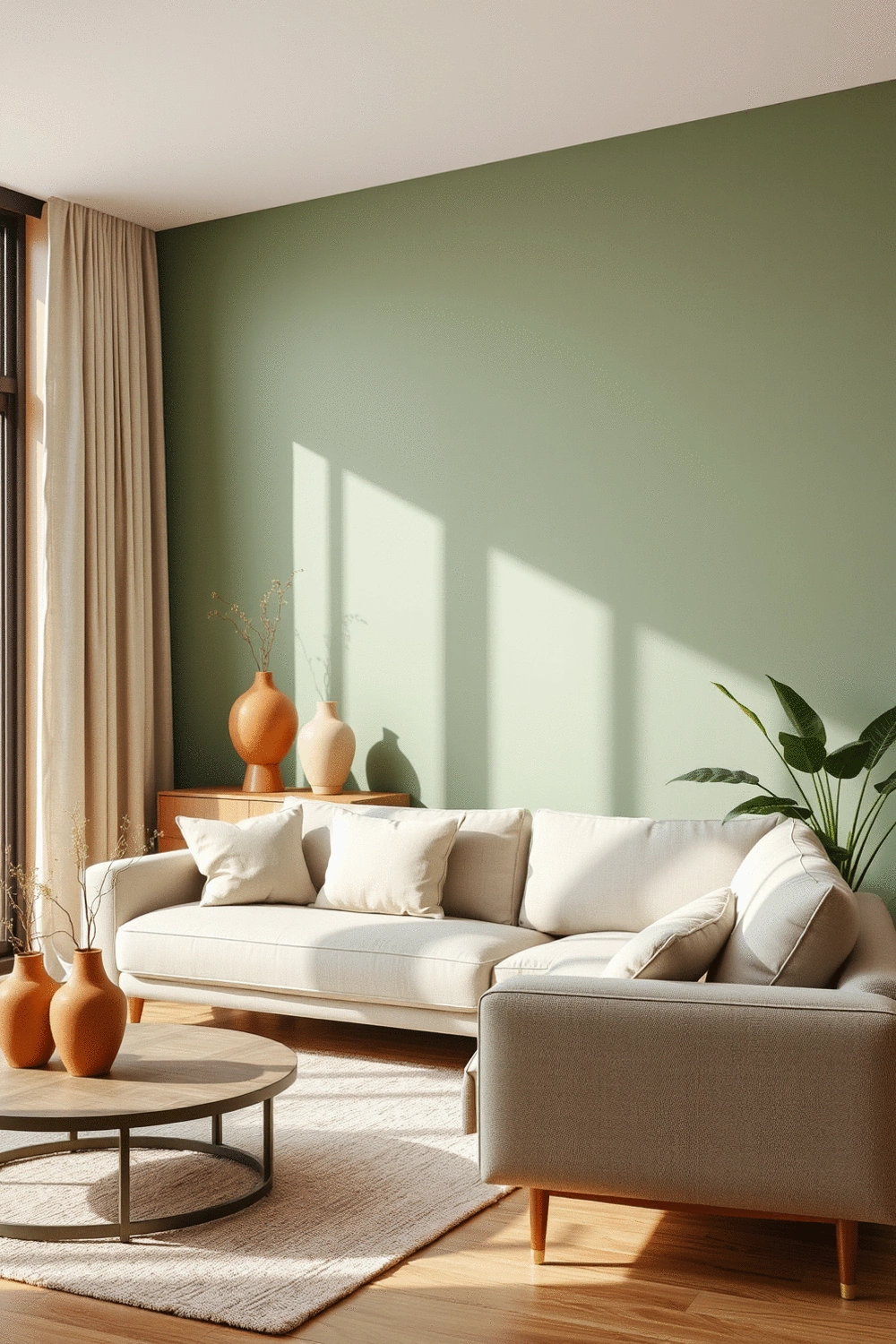
Creating a Dynamic Living Space with Changing Hues
Transitioning your home’s colors seasonally can breathe new life into your space. I find that using different natural palettes can make all the difference. For example, consider earthy greens and warm browns in the fall, which can then shift to light blues and soft whites in winter, enhancing your living area’s appeal.
- Fall: Rich oranges, deep reds, and browns.
- Winter: Soft whites, icy blues, and muted greys.
- Spring: Fresh greens, vibrant yellows, and light pastels.
- Summer: Bright corals, turquoise, and vivid greens.
Changing colors can help your home feel more connected to the environment outside. Feel like your space could use a refreshing look? Dive into my article on color psychology tips for boosting small space mood for more insights on how color can uplift your living spaces!
Embracing Color Trends for Seasonal Decor
Staying on top of current color trends can really elevate your seasonal decor! Each year brings fresh hues that can enhance the mood of your rooms. Popular colors for this coming season include soft terracotta and calming sage that resonate with a nature-inspired aesthetic.
- Explore hues like deep emerald greens or vibrant coral for modern touches.
- Consider neutrals with a twist, like greige (grey-beige), which can fit into any season.
- Utilize pops of trending colors in art pieces or accent furniture for an updated feel.
Being mindful of color trends can help you create spaces that are not only stylish but also inviting. Curious about how to select the perfect colors for your bedroom gallery wall? Check out my guide on choosing the perfect color scheme for your bedroom gallery wall to get inspired!
For more ideas on creating an inviting atmosphere, explore how to use textures and fabrics for an inviting home, or discover top bedroom color schemes for restful sleep.
FAQs about Nature-Inspired Color Palettes
- Q: What are the main benefits of using nature-inspired colors in home decor?
- A: Nature-inspired colors enhance well-being, reduce stress, create cohesion with various decor styles, and evoke feelings of warmth and safety, turning your home into a tranquil sanctuary.
- Q: How does Biophilic Design influence color choices?
- A: Biophilic design encourages incorporating natural elements, including colors like greens, browns, and blues, into living spaces to mimic nature and foster emotional connections to the environment, thereby enhancing emotional health.
- Q: What is color theory, and how can it be applied to nature-inspired palettes?
- A: Color theory is the framework for understanding how colors interact. Applying it means using complementary colors for vibrant contrast, analogous colors for harmony, and triadic schemes for balanced dynamism to enhance a home's ambiance.
- Q: How can I adjust my home's color scheme seasonally?
- A: You can refresh your home's color palette seasonally by swapping out interchangeable accents like throws, pillows, or artwork. Use autumn hues (rust, mustard) in fall, icy blues and soft whites in winter, pastels (mint, lavender) in spring, and vibrant colors (coral, turquoise) in summer.
- Q: What are some current color trends that align with a nature-inspired aesthetic?
- A: Current color trends that resonate with a nature-inspired aesthetic include soft terracotta and calming sage. Other popular hues like deep emerald greens, vibrant coral, and versatile neutrals such as greige can also elevate your seasonal decor.
Recap of Key Points
Here is a quick recap of the important points discussed in the article:
- Enhances Well-Being: Nature-inspired colors uplift mood and reduce stress.
- Biophilic Design: Incorporate greens, browns, and blues to connect your space with nature.
- Color Theory: Utilize complementary, analogous, and triadic color schemes for harmonious design.
- Seasonal Adjustments: Change accents seasonally with colors like rust and mustard in fall, icy blues in winter, pastels in spring, and vibrant colors in summer.
- Stay Trendy: Explore current color trends like soft terracotta and calming sage to elevate your decor.