Did you know that harmonizing colors in your home can transform not just your space, but your mood as well? Let's explore how the right color choices can elevate your decor.
As an Amazon Associate I earn from qualifying purchases. Affiliate links may earn me a commission at no extra cost to you.
What You Will Learn
- The importance of harmonizing wall art with your furniture and textiles for a cohesive design.
- How to apply color theory principles—such as complementary and analogous colors—to elevate your home decor.
- Strategies for using the color wheel to select art that enhances your room's dominant colors.
- Steps to identify key colors from your artwork and create a custom color palette for your decor.
- Tips on applying the 60-30-10 rule for balanced color distribution in your space.
- Practical advice for coordinating colors in small spaces or rentals without permanent alterations.
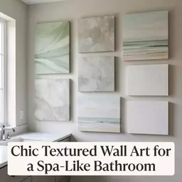
Understanding the Essentials of Wall Art Color Coordination
Color coordination in wall art is the heartbeat of home decor. It’s not just about slapping a few pieces on the wall; it’s about creating a cohesive atmosphere that resonates with your style. When done right, it can transform a bland room into a space that sparks joy and invites warmth. So, let’s dive into why harmonizing art with furniture and textiles matters!
Why Harmonizing Art with Furniture and Textiles Matters
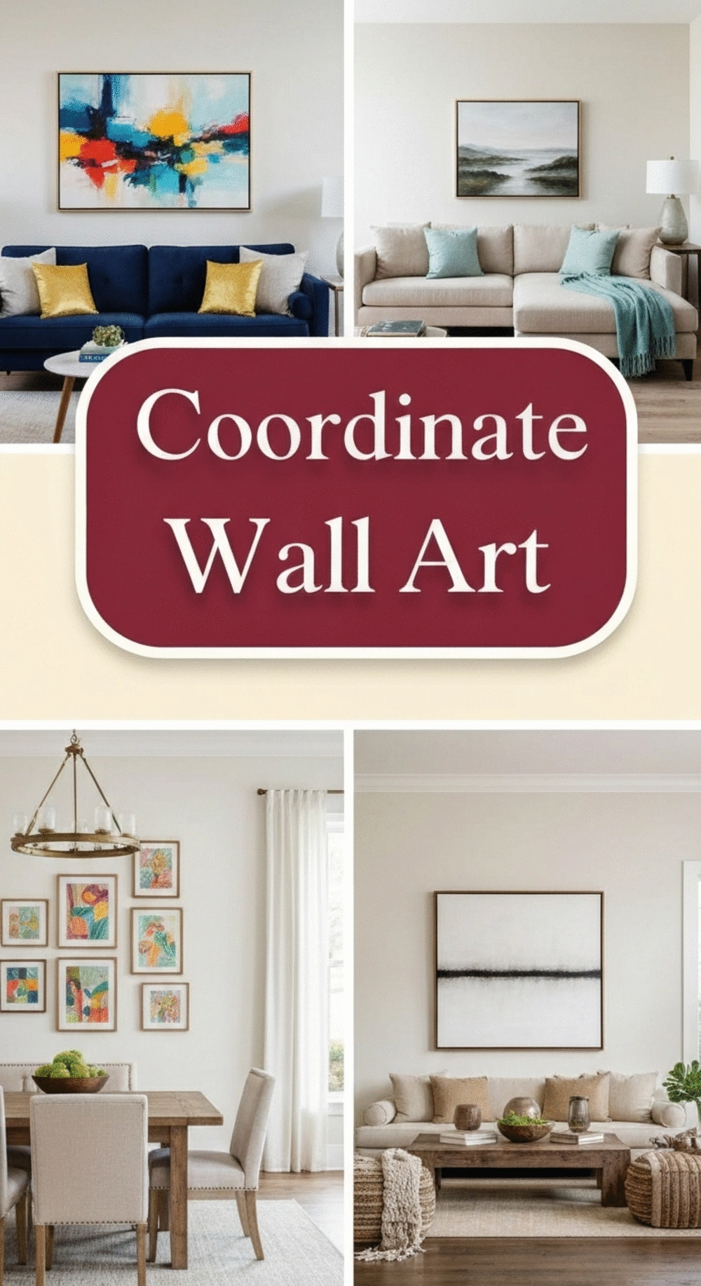
Integrating your wall art with existing furniture and textiles is vital for a unified look. When your art complements your sofa or your favorite rug, it creates a sense of flow throughout the space. This visual connection can make your home feel more sophisticated and intentional. Here are a few reasons why it’s crucial:
- Creates a cohesive design that feels curated rather than chaotic.
- Enhances the overall mood of the room, making it more inviting.
- Increases the perceived value of your decor choices.
By thoughtfully choosing colors that echo throughout your furnishings, you can enhance the beauty of your space. It’s like weaving a story through your home where every piece plays its part!
Exploring the Role of Color Theory in Home Design
Color theory is a fascinating subject that can elevate your design game. It’s not just about choosing colors you like; it’s about understanding how they interact. For example, complementary colors (colors opposite each other on the color wheel) can create a vibrant contrast, while analogous colors (next to each other) provide harmony. Integrating these concepts can help you choose wall art that lifts the entire room's energy.
- Complementary colors energize: Think vibrant reds with cool greens.
- Analogous colors soothe: Soft blues paired with gentle greens create calm.
- Monochromatic schemes offer sophistication: Different shades of one color give depth.
Understanding these principles helps you make informed decisions that reflect your personal style while also enhancing your home’s vibe! For more insights into creating harmonious living spaces, consider exploring how to create inviting spaces.
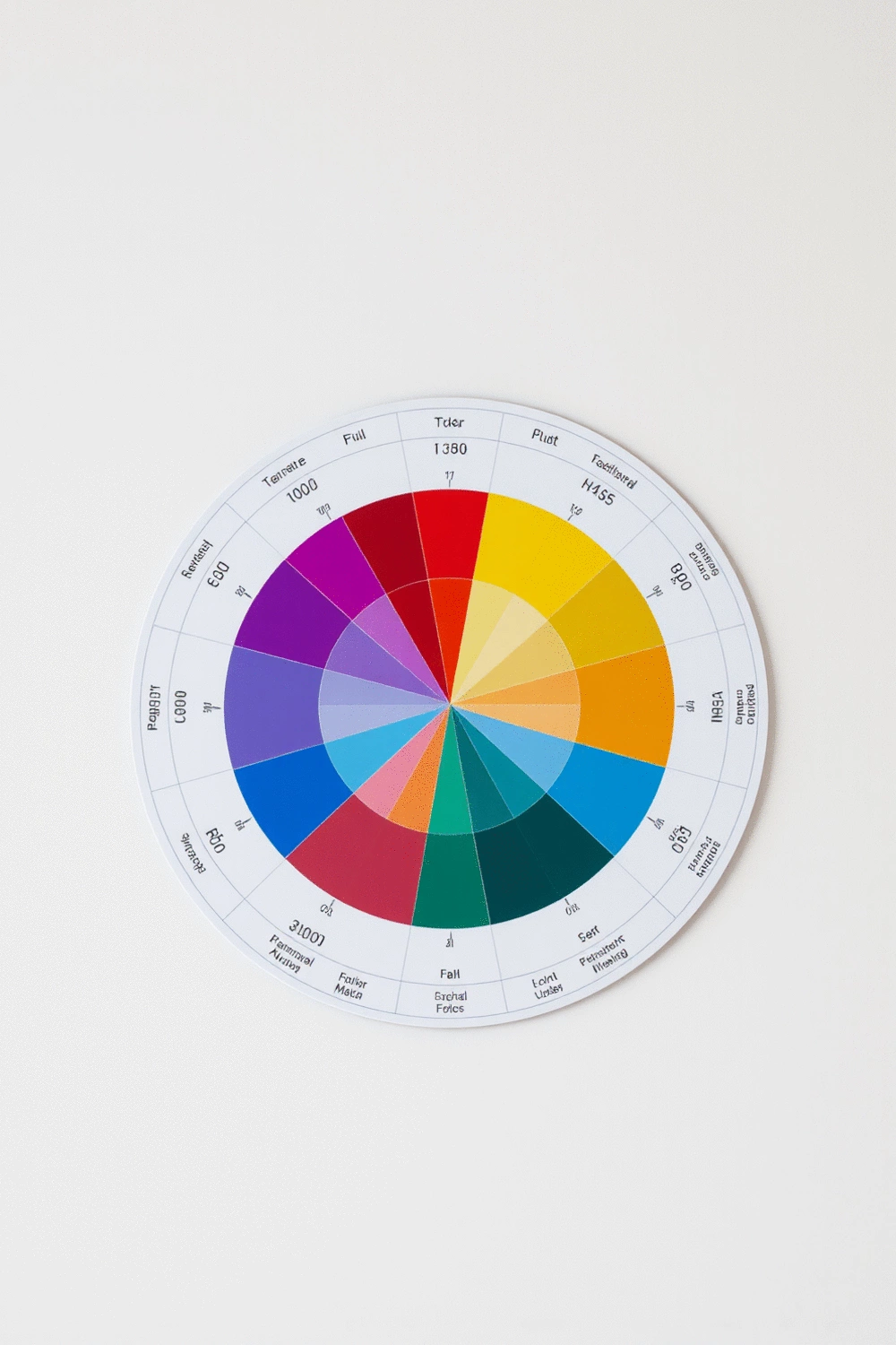
Utilizing the Color Wheel to Enhance Your Space
The color wheel is your best friend when it comes to choosing wall art. It visually represents color relationships and can guide you in selecting pieces that will work well together. Here’s how to effectively use it:
- Start with your dominant color: Identify the main color in your room, usually found in the furniture or major decor pieces.
- Choose complementary pieces: Look across the wheel for colors that contrast yet enhance your dominant shade.
- Consider the mood: Warm colors like reds and oranges can energize, while cool colors like blues inspire calmness.
By using the color wheel, you can make art selections that not only beautify but also create a mood that aligns with your lifestyle. Ready to dive deeper? Check out my post on choosing the perfect color scheme for a gallery wall for more insights!
Step-by-Step Guide to Coordinating Wall Art Colors
As an interior design enthusiast, I've come to appreciate the magical transformation that wall art can bring to a space, especially when the colors are well-coordinated with other elements in your home. The key to achieving a cohesive look lies in understanding how to pull colors from your artwork and apply them thoughtfully throughout your decor.
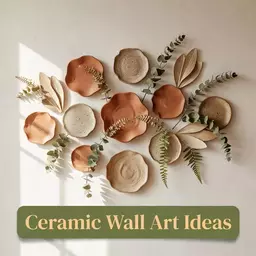
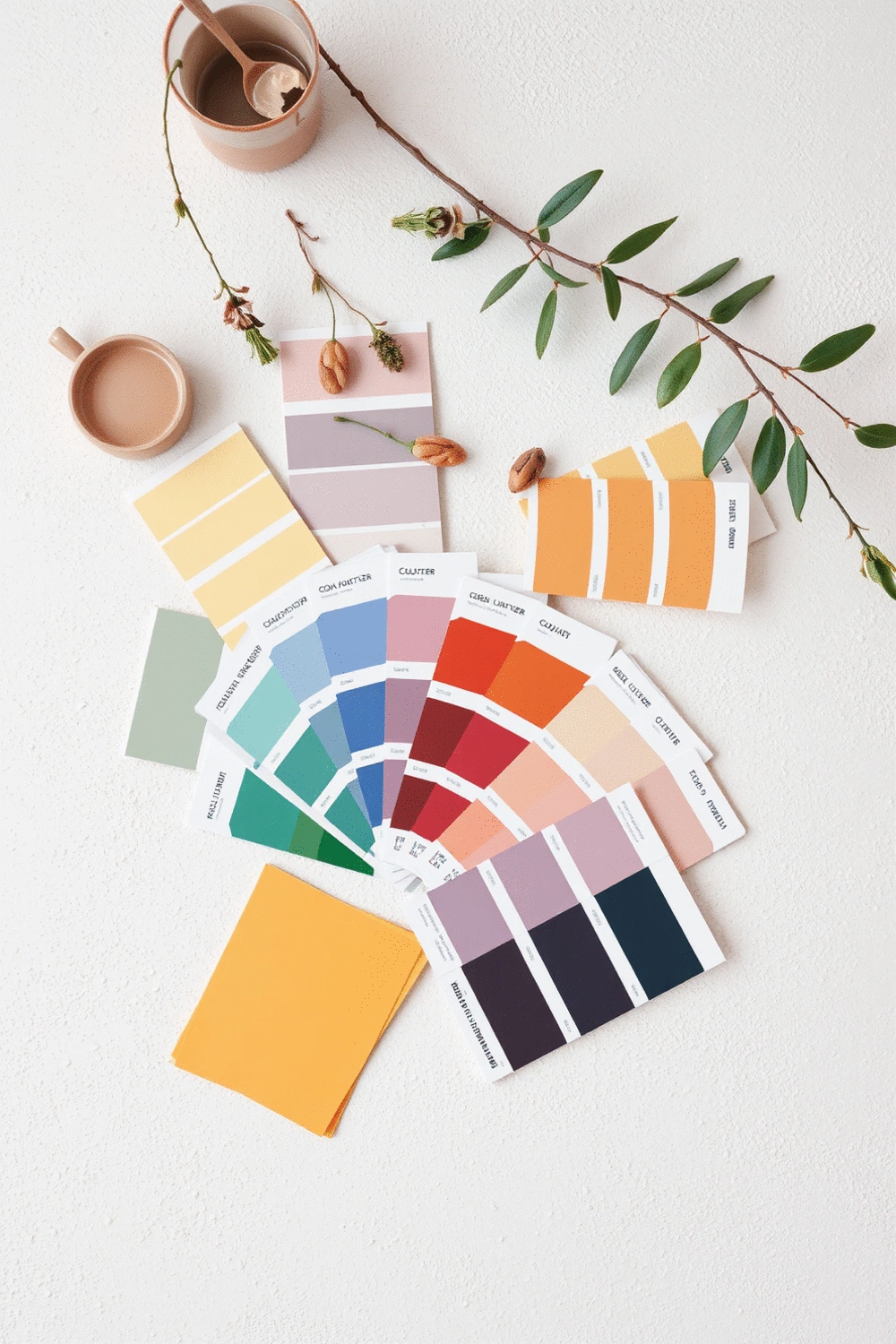
Identifying Key Colors from Your Artwork
To start the journey of color coordination, let's dive into identifying the key colors that will guide your decor choices. This involves a few simple steps that can significantly enhance your space.
- Pulling Colors that Speak: Look closely at the artwork you plan to display. Which colors stand out to you the most? These will become your focal points.
- Understanding Dominant and Accent Colors: Determine the dominant color in your art piece, then find accent colors that complement it. This creates a visual dialogue between your wall art and other elements.
- Creating Custom Color Palettes for Your Home Decor: Use tools like paint swatches or online color palette generators to create a palette based on your artwork. This will help ensure a harmonious blend throughout your space.
By taking these steps, you'll not only create a visually appealing environment but also make your walls tell a story that resonates with your personal style. If you're curious about more ways to choose colors for specific areas, check out my post on how to choose the perfect color scheme for your bedroom gallery wall.
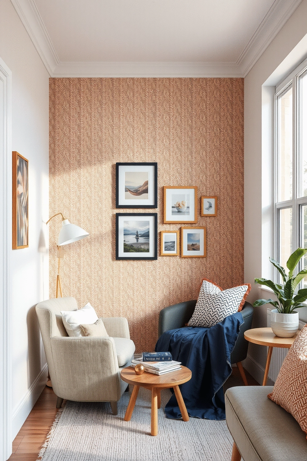
Matching Art with Furniture and Textiles
Once you have your color palette established, the next step is to match your wall art with your furniture and textiles. This is crucial in creating a balanced and harmonious space.
- Applying the 60-30-10 Rule for Balanced Spaces: This classic rule suggests using 60% of a dominant color, 30% of a secondary color, and 10% of an accent color in your decor to maintain balance.
- Coordinating with Pillows, Rugs, and Curtains: Choose textiles that echo the hues in your wall art to strengthen the connection between these elements.
- Incorporating Fabric Patterns for Added Depth: Patterns can add interest and texture. Ensure they align with your established palette for a cohesive look.
I find that this approach helps each element of the room feel intentional and well-thought-out. For a deeper dive into color palettes and how they can influence your decor, don’t forget to check out my insights on color psychology tips for boosting small space mood.
Practical Tips for Small Spaces and Rental Solutions
Coordinating colors in a small space or rental can feel daunting, but it doesn’t have to be! Here are some practical tips tailored for these unique challenges:
- Using Removable Wallpaper and Temporary Art: These solutions allow you to bring color without commitment, perfect for rental spaces.
- Maximizing Color Impact in Limited Areas: Use bold colors strategically to create focal points, making your space feel larger and more inviting.
- Space Planning Techniques for Effective Layouts: Consider the flow of the room and how colors interact to create a harmonious visual journey.
By implementing these strategies, you can elevate even the smallest of spaces into cozy environments that reflect your personal style. Remember, every inch counts when it comes to creating a warm and inviting home! You might also find valuable tips on small bedroom solutions to optimize your living areas.
Frequently Asked Questions (FAQs)
- Q: Why is color coordination in wall art important for home decor?
- A: Color coordination creates a cohesive design, enhances the overall mood of the room, and makes your home feel more sophisticated and intentional.
- Q: How can color theory help in choosing wall art?
- A: Color theory, including principles like complementary (opposite on the color wheel for contrast) and analogous (next to each other for harmony) colors, helps you understand how colors interact to choose art that elevates the room's energy.
- Q: What is the 60-30-10 rule in home decor?
- A: The 60-30-10 rule suggests using 60% of a dominant color, 30% of a secondary color, and 10% of an accent color to achieve a balanced and harmonious color distribution in your space.
- Q: How can I identify key colors from my artwork to guide my decor choices?
- A: Look for colors that stand out the most in your artwork, identify dominant and accent colors, and then use tools like paint swatches or online color palette generators to create a custom palette for your decor.
- Q: What are some practical tips for coordinating colors in small spaces or rentals?
- A: Use removable wallpaper and temporary art for flexibility, maximize color impact strategically in limited areas to create focal points, and apply space planning techniques to ensure colors interact harmoniously within the room's flow.
Recap of Key Points
- Harmonizing wall art with furniture and textiles creates a cohesive and inviting atmosphere.
- Understanding color theory, including complementary and analogous colors, enhances the energy of your space.
- Utilizing the color wheel helps in selecting wall art that complements your room's dominant color.
- Identifying key colors from your artwork can guide your decor choices for a harmonious blend.
- Applying the 60-30-10 rule ensures a balanced use of colors in your decor.
- Practical tips for small spaces include using removable wallpaper and maximizing color impact strategically.